TreeINFO Forms Documentation
Introduction
The subject of the documentation is to describe and explain the functionalities, elements of the TreeINFO Forms. The document content is intended for administrators who will use and manage the documented application. The aim of the documentation is to simplify the work with the application and it is better understanding. Basic administrative procedures will be explained.
If this documentation doesn't answer your questions, please send us Email to treeinfo@aricoma.com.
Join TreeINFO community at Stack Overflow TreeINFO Team. If you need access, contact treeinfo@aricoma.com.
Release
Build 1.13.25003.19002 Hotfix 24.3.2025
- Fixed Association of new fields and forms – Fixed functionality for associating new field and form objects through the TreeINFO application.
- Fixed Attachments display fix on subsites – Author and creation date were not displayed correctly on subsites.
- Fixed Task Form Customization – When clicking on an item in the task list, the item form now reliably opens every time.
Note See all the latest features, enhancements, updates and more in Changelog here.
About
TreeINFO Forms application is central element of customization that allows you to create custom forms for SharePoint documents / lists, modify SharePoint columns and can be integrated with workflows.
Installation
This chapter describes adding TreeInfo FullControl application to individual sites or subsites.
SharePoint Online
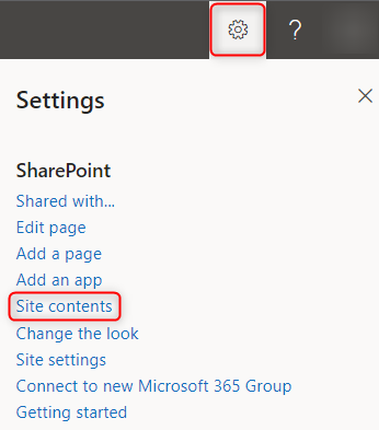
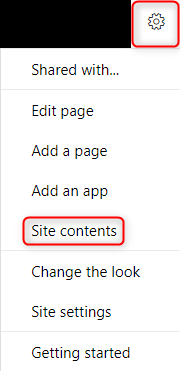
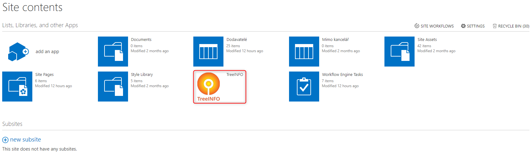
To add WFEngine.Online application to site in the SharePoint Online click on the cogwheel button symbolizing settings and select option Site contents.
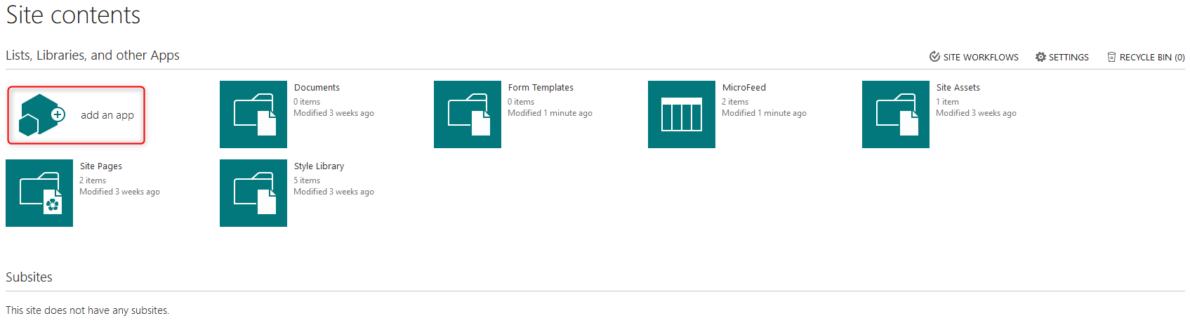
After selecting the option Site contents click on the button add an app to add application to site
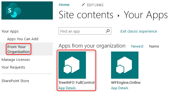
Click on the option From Your Organization found on the side menu. Clicking this option will display the list of applications of our organization. Click the button TreeINFO FullControl
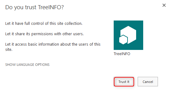
After clicking the button TreeINFO FullControl a popup window will appear asking if you trust this application and if you want to give this application full authorization on the given site. Click the button Trust It
Next you will be redirected to the page Site contents where we can see the addition of our selected application to the site. We are informed about this addition through the notice We're adding your app.
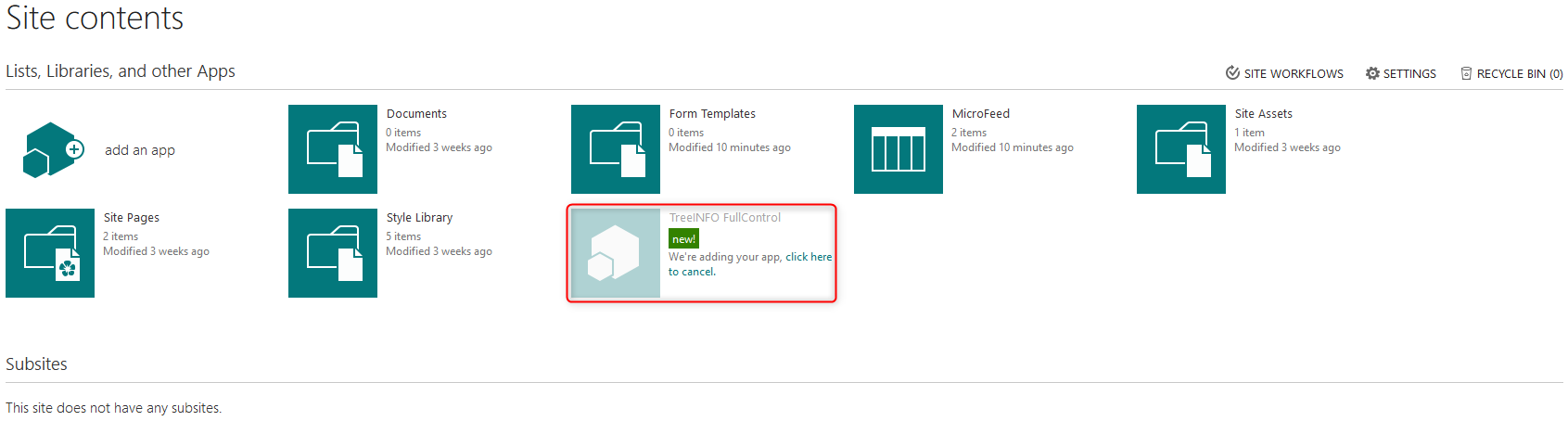
After a while the notice will disappear and the application will gain an icon
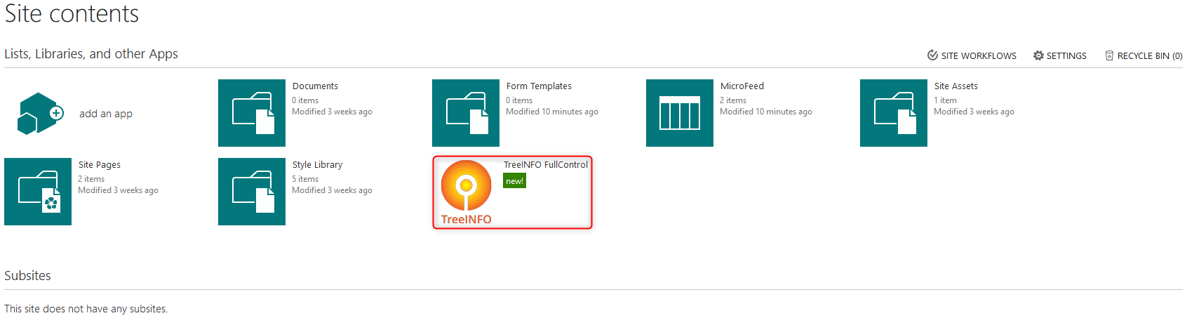
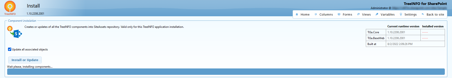
For correct and fully functional addition of application to the site we need to open the application. We should see the main page divided into two sections. In the section Changing the major version we can find an option Upgrade component. Open this option
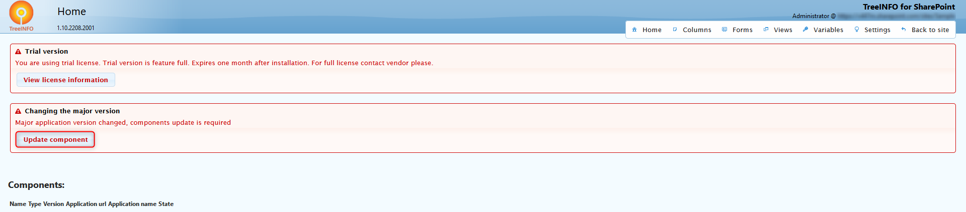
In the newly opened window in the top right corner we can see that the application does not have installed any version. To finish the installation of the application click the button Install or Update.
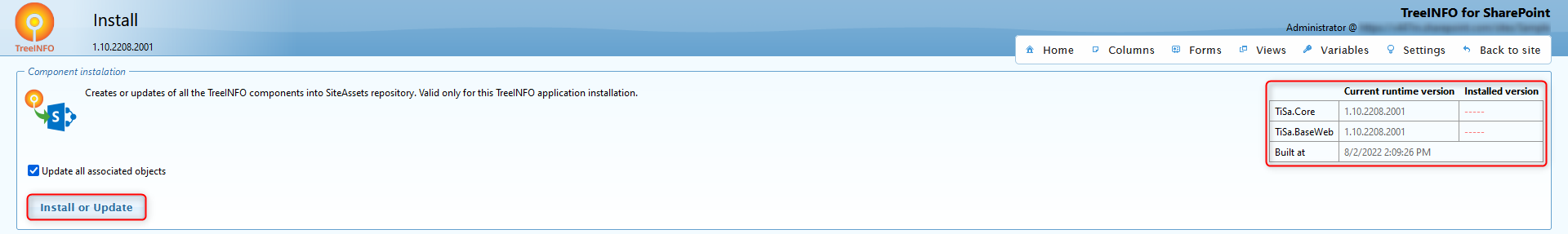
You will be informed about the installation progress through the progression bar
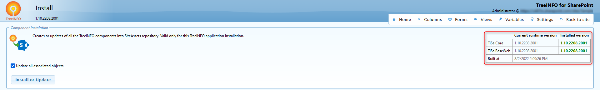
You can confirm that the installation was a success by checking the top right corner. The current installed version will be shown. The application is now ready for use.
How to access
Access slightly differs for SharePoint Online and SharePoint On-Premises.
SharePoint Online
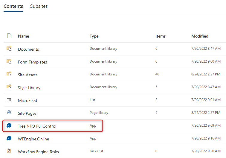
Navigate to settings menu accessible through gear icon, select Site contents and select TreeINFO FullControl.
SharePoint On-Premises
Navigate to settings menu accessible through gear icon, select Site contents and select TreeINFO FullControl.
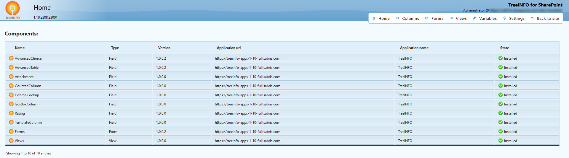
TreeINFO Forms
The TreeINFO Forms application is divided into several parts, which are accessible after opening from the Site contents.
The tab Columns allows you to make adjustments at the level of single columns, the Forms tab is used to set up individual forms, Views allow you to customize libraries views, Variables offer connections to external resources and Settings offer other options.
The individual parts are described further in the documentation.
Columns
In Columns section it is possible to modify the behavior of standard SharePoint site columns. You can:
- Create new field – creates brand new column and appends the field modification.
- Associate existing field – appends a behavior modification to an already existing field.
- Update all – update configuration of all modified fields. Applicable for core function updates.
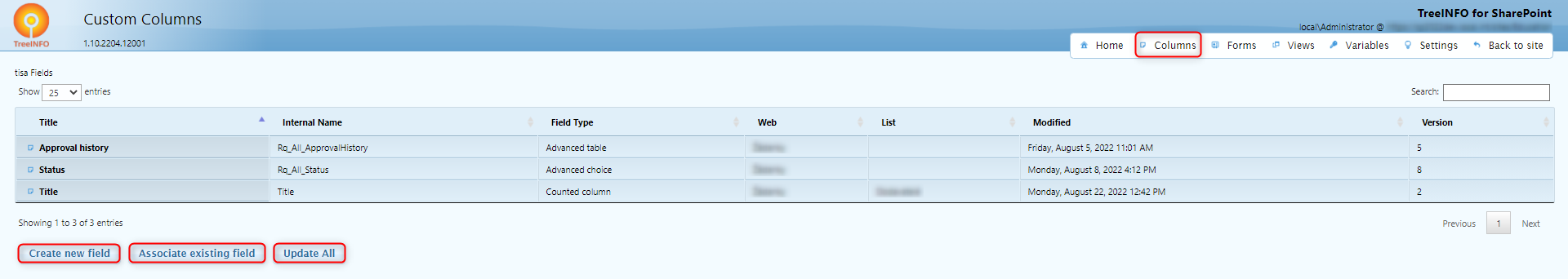
Buttons Create new field and Associate new field lead to edit page.
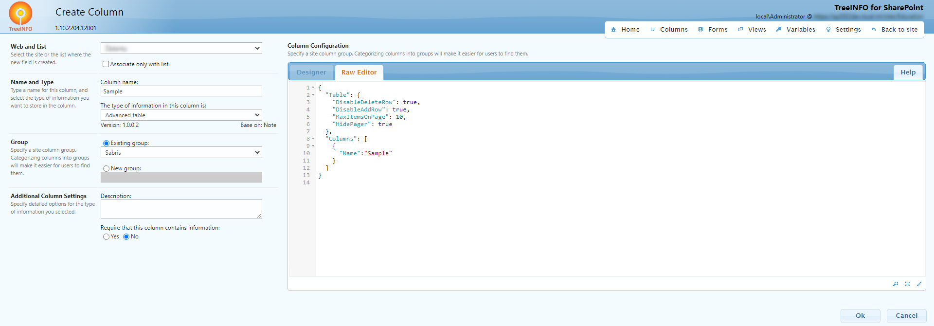
The left part is dedicated to basic information about the column. When associating an existing field, some of those information are prefilled from column definition.
Prevent content to be overwritten via import – prevents content to be overwritten by import or by agenda update.
Custom column can be associated for the whole site collection or only for a list. In Name and Type section is drop down selection of applicable TreeInfo column based on associated column.
Custom column modification is done only in the text editor of the code in JSON format. Individual options for each column are described in further chapters.
In Editor, you can also view code in find, fullscreen a specific phrase or letter or automatically format code through buttons situated in the bottom right corner of the edit window, as shown on the picture bellow.
In the right part you can edit the column code and:
- Delete – not only deletes the column definition but also the column within SharePoint
- Unregister – removes associated modification on the column, column is kept in SharePoint
- Update – updates modifications of a column, after execution the changes are reflected in form
- Ok – updates modifications and closes the editor
- Cancel – does not save changes and closes the editor
Currently TreeINFO Forms application supports following custom columns:
Forms
In the Forms tab we can modify behavior of forms on SharePoint web. Through the following buttons we can:
- Associate new form – allows to add form definition to already existing SharePoint Content Type (from the web in which the App was added to)
- Update all – update configuration of all existing forms (not always mandatory but appropriate after deployment of a new App version)
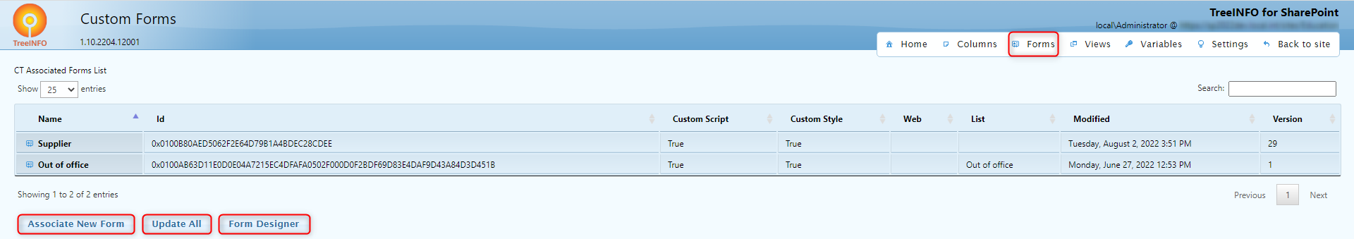
After selecting the option Associate new form a page with following options (left side of the screen) will be shown:
- Web selection and selection of existing content type in said web for which the form will be defined
- Show (through Show fields) SharePoint field defined in content type including their internal names and types (appropriate especially in form definition where we work with column internal names).
- Allow or keep nonactive options of custom script or form appearance
- Define if the form modification script will be compressed or not (lowers the volume of data that is transferred by viewing the form). It is appropriate to turn off the compression for tuning the script in browser
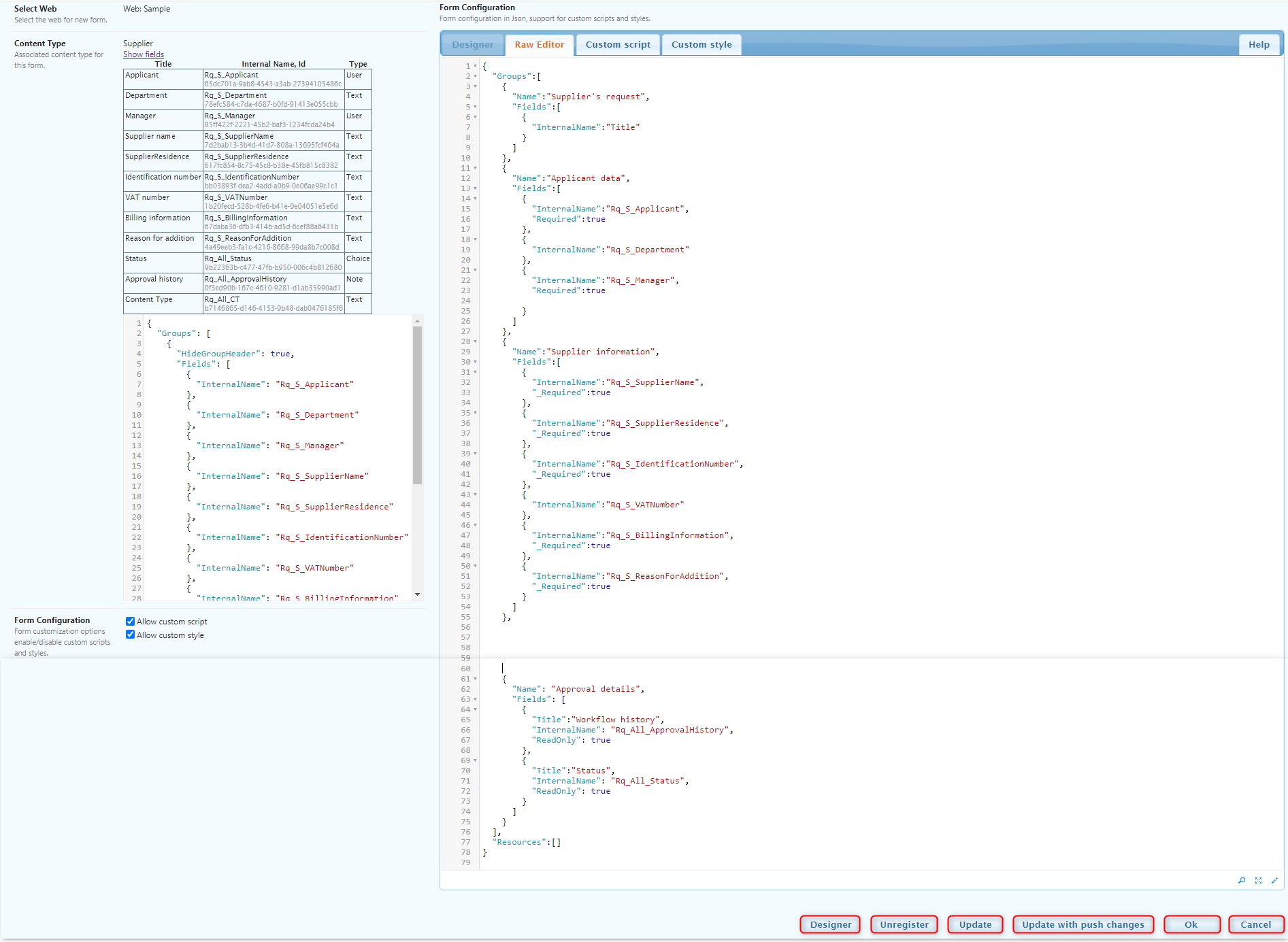
Prevent content to be overwritten via import – prevents content to be overwritten by import or by agenda update.
It is possible to connect new form definition to content type or abandon form definition without saving through the buttons Associate and Cancel.
By entering through the list of already defined forms the user does not have the option to change the web neither can he change the content type with which is the form associated. The other options of the left side of the screen are still active. In addition, the following buttons are displayed on the bottom right corner:
- Designer – opens form editor designer
- Unregister – removes association of form from content type
- Update – update of the form definition
- Update with push changes – update of the form definition (similar to Update) and copies into child forms
- Ok – updates form (same as "Update") and returns back to the list of forms
- Cancel – cancel changes
The Designer offers the possibility to manage form definition in UI. User can drag and drop fields and build form with a preview. Each field has options where it is possible to set required or read only. There is a possibility to use script editor and other options from the ribbon button.
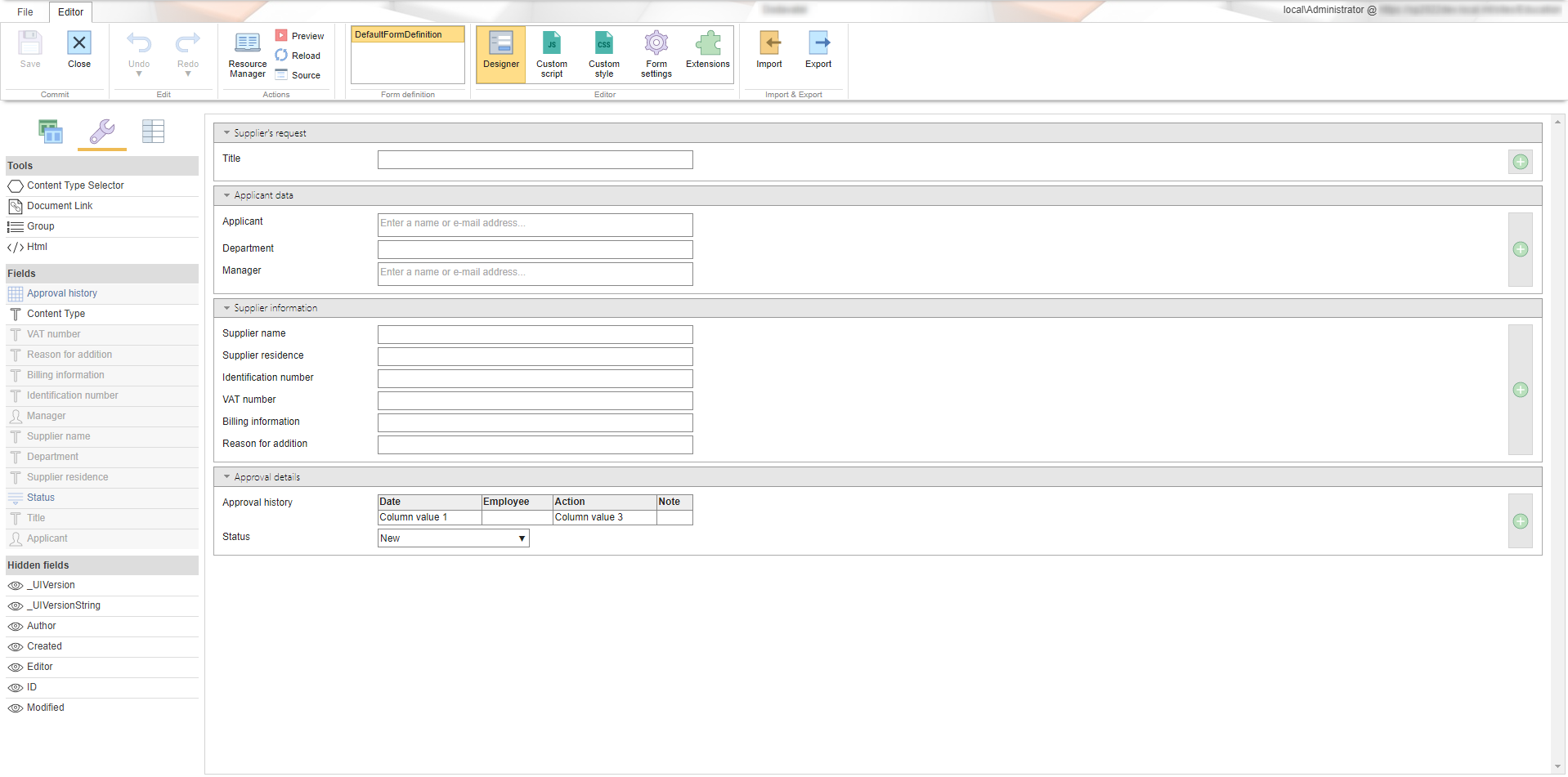
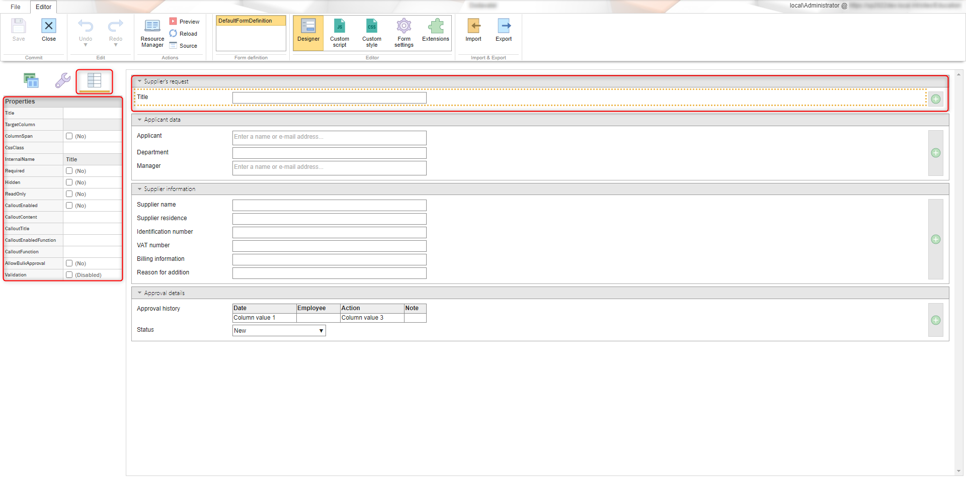
The form definition can also be created or edited from the tabs in the input screen when opening a form:
RawEditor – through the text edit in JSON you can define basic properties of the form:
- configuration of the documents preview
- configuration of the metadata print
- definition of display for groups of metadata, either as sections or tabs
- definition of related javascripts etc.
In Raw Editor it is also possible to define fields/metadata of an item or more precisely groups of metadata which are supposed to be displayed on a form
For each group it is possible to define:
- Name
- if the group should be displayed in a default state minimalized or maximized
- which metadata (through the internal names of SharePoint columns) should be displayed
For individual field it is possible to define:
- if they are read only
- if they are hidden
- validation logic
Custom script – through JavaScript text edit it is possible to expand the behavior of a form component and some fields. Edit or addition of a custom script is recommended to be consulted with the supplier.
Custom style – it is possible to define visual aspects of a form through CSS
Edit window allows for automatic formatting of content and also for the option to display on a whole page. Also shows potential error in code next to the number of the line
Additional information about form definitions (E.g. examples of definition) can be found further here.
Views
Visual and functional configuration of library. Views are designed to enhance standard SharePoint library/list view. You can add custom view or you can add custom buttons to ribbon with custom scripts.
Prevent content to be overwritten via import – prevents content to be overwritten by import or by agenda update.
You can apply same custom script definition as in forms. The most used functionality is the use of ribbon buttons, described here.
New Document link configuration
The following options allow the reconfiguration of New Document link in view. Default link configuration is situated in the root of NewDocumentLink attribute, alternative in AlternativeNewDocumentLinks attribute. (e.g. If different button for root file is required).
Note If AlternativeNewDocumentLinks are defined and the condition with Level or IsInRootFolder is met, then NewDocumentLink is not used.
Configuration example:
{
  "NewDocumentLink":
  {
    "Title": "Add document"
  },
  "AlternativeNewDocumentLinks":
  [
    {
      "Title": "New folder",
      "IsInRootFolder": true,
      "ContentTypeId": "0x012000C894D9EEFB9C9A1188428943D58A3177",
    },
    {
      "Title": "Nový spis",
      "Level": 2,
      "ContentTypeId": "0x012000C894D9EEFB9C9A1188428943D58A3177",
    }
  ]
}
-
Title
"Title": "New File"
The text that contains the link -
ContentTypeId
"ContentTypeId": "0x012000C894D9EEFB9C9A1188428943D58A3177"
Content type ID for new itemContent type configuration for new Item. ID site content type can be used.
-
IsInRootFolder
"IsInRootFolder": true
Use only in root FolderIf set to true, definition is applied only in root folder. Used only in "AlternativeNewDocumentLinks"
-
Level
"Level": true
The level of the folder in relation to the whole directory structureLevel 1 is the root folder. Only used in "AlternativeNewDocumentLinks"
Variables
Prevent content to be overwritten via import – prevents content to be overwritten by import or by agenda update.
In the Variables tab it is possible to simply adjust user defined strings available through SharePoint environment in so called PropertyBag.
The strings are saved as a pair of name and value through the button Add entry. Individual strings can be then edited or deleted.
When a variable is created two additional columns are generated, JSON and JS. These contain variable name that can be used in JSON or in custom script of forms or views
Variables are generaly used to connect to a database, to another SharePoint site within a farm or to define unique variables for the form modification.
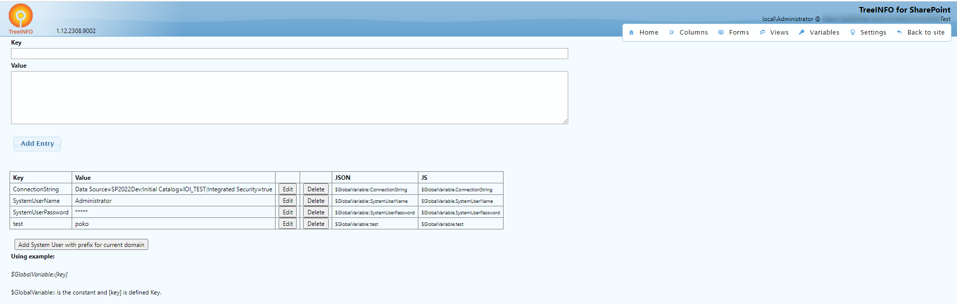
You can setup administration account in TreeINFO for SharePoint using Variables:add key SystemUserName and value name of user with site collection administrator permission, then add password for admin account key SystemUserPassword. This is safe operation – Password is encrypted. This settings is necessary for adding attachment or for execution of some custom scripts.
Settings
Settings tab offers enhance functionalities to forms and workflows.
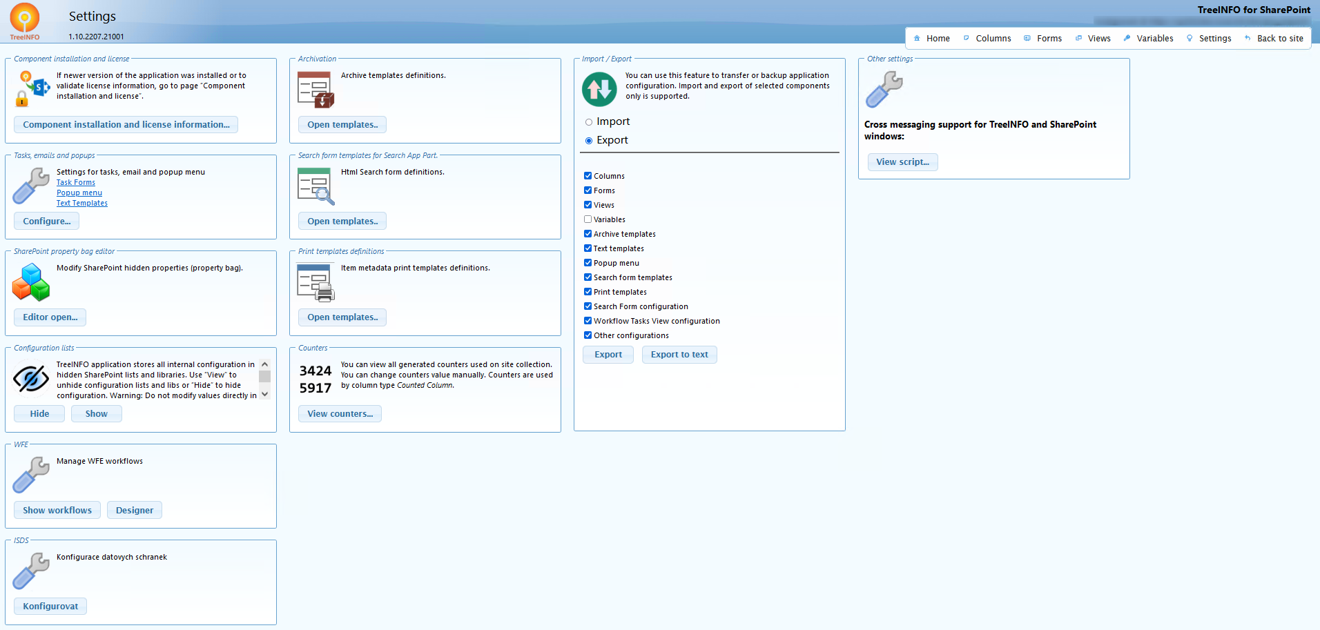
Component installation and license – If newer version of the application was installed or to validate license information, go to page Component installation and license.
Tasks, emails and popups – Settings for tasks, email and popup menu, reusable via Replace tokens also in Workflow Engine Designer. Click for more
Configuration lists – TreeINFO Forms application stores all internal configuration in hidden SharePoint lists and libraries. Use View to unhide configuration lists and libraries or Hide to hide configuration. Note Do not modify values directly in configuration lists and libraries – configuration may be lost or corrupted.
WFE – Manage WFE workflows, enables viewing workflow XML configuration from Workflow Engine Designer.
Archivation – Archive templates definitions. Click for more
Search form templates for Search App Part – HTML Search form definitions. Click for more
Print templates definitions – Item metadata print templates definitions. Click for more
Counters – You can view all generated counters used on site collection. You can change counters value manually. Counters are used by column type Counted Column.
Import / Export – You can use this feature to transfer or backup application configuration. Only imports and exports of the selected components are supported.
This feature was updated in Q1 2023 release (more information in changelog section). Configuration elements that contained HTML code are not encoded in base64 anymore but are enclosed in CDATA xml element. Small deviations in export files when exporting through UI or REST service were also unified. New export version is more readable for better comparison. Old import files are backwards compatible with import/export feature.
Tasks, emails and popups
You can define replace tokens to use in the forms or in the workflow process. There are few options to choose from – text template, task template, mail template and view template. It is possible to associate it with different languages.
Prevent content to be overwritten via import – prevents content to be overwritten by import or by agenda update.
Text template is used for simple text. You can use it in Workflow Engine – for example as an outcome name, where you only put it in replace token form {TiSp:outcomeTemplate}. If defined for multiple languages, outcome will be displayed in users language.
Task template is designed to be used in Workflow Engine activity Assign task in property Task template. It simplifies edit of task title and body, replace tokens are supported. {Item:s_invoiceType} | {Item:s_invoiceNumber} to approve
With mail template you can edit the mail body which is sent to user from Workflow Engine Assign task activity in property Mail template. You can use html and CSS:
<style type="text/CSS">
    .message {
        font-family: "Calibri",sans-serif;
    }
    .message p {
        margin: 4pt 15pt;
    }
    .block {
        border-top: 2pt solid #789bbb;
        border-bottom: 2pt solid #789bbb;
        padding: 0.4cm 0cm 0.4cm 0cm;
    }
    .head {
        text-align: right;
        font-style: italic;
        padding: 0cm 0.2cm 0.1cm 0.1cm;
        font-size: large;
    }
</style>
<div class="message">
    <div class="head">
        New task notification
    </div>
    <div class="block">
        <p>A new task was assigned to you: {{Task.Title}}</p>
        <p>{{Task.Body}}</p>
        <p>All your task can be found at: <a href="{{Web.Url}}">{{Web.Title}}</a>.</p>
        <p>Direct link to task <a href="{{Task.Url}}">here</a>.</p>
    </div>
</div>
CSS can also be defined within the text template and then applied to mail template:
{{Template:EmailTemplateStyles}}
<div class="message">
  <div class="head">
    New task notification
  </div>
  <div class="block">
    <p>A new task was assigned to you: {{Task.Title}}</p>
    <p>{{Task.Body}}>/p>
    <p>All your task can be found at: <a href="{{Web.Url}}">{{Web.Title}}</a>.</p>
    <p>Direct link to task >a href="{{Task.Url}}">here</a>.</p>
  </div>
</div>
Archive process template / notification
Prevent content to be overwritten via import – prevents content to be overwritten by import or by agenda update.
Copy/move items from source to destination list according to defined template rules.
Queries all "Source" items (standard caml query) and copies each item into "Destination" list – destination list or folder may be automatically created.
Supported via triggered custom script.
Archivation template example
{
  "DeleteSource": false,
  "CopyRoleAssignments": true,
  "IncludeResultMetadata": true,
  "Logging":{
    "ListUrl": "{SiteUrl}/Lists/ArchiveLog"
  },
  "Source":
  {
    "ListUrl":{
      "Expression":"{SiteUrl}/MyProcess"
    },
    "CamlQuery":{
      "Expression":"<eq><fieldref name='ID'><value type='Counter'>146</value></fieldref></eq>"
    },
    "RowLimit": 5
  },
  "Destination":
  {
    "ListUrl": {
      "Expression": "{SiteUrl}/Archive/{List:Name}-{Item:Modified.Year}-{Item:Modified.Month}"
    },
    "ListTitle":{
      "Expression": "{List:Title} {Item:Modified.Year}-{Item:Modified.Month}"
    },
    "FolderPath":{
      "Expression": "{Path}"
    }
  }
}
Archive configuration (attributes)
-
DeleteSource
"DeleteSource": false
Deletes source item after copy to destination list (move operation) -
CopyRoleAssignments
"CopyRoleAssignments": true
Copy source item permissions from source to destination item -
CopyRoleAssignmentsAsRead
"CopyRoleAssignmentsAsRead": true
WhenCopyRoleAssignmentsis set to true, theCopyRoleAssignmentsAsReadoption can be used to copy source item permissions from the source to the destination item as read-only. -
IncludeResultMetadata
"IncludeResultMetadata": true
Result of archive process contains copied metadata if true. -
CopyCommonFields
Use to copy system fields."CopyCommonFields": [ "Editor", "Modified" ] -
CopyFolderContents
"CopyCommonFields": true
If true copies content of folder. -
Source
Source list url, you can use {SiteUrl} and {WebUrl} tokens in Expression."Source": { "ListUrl":{} "Expression":"{SiteUrl}/MyProcess" } -
Destination
Uses or creates destination list "ListUrl" and folder, supports external site destination."Destination": { "ListUrl": { "Expression": "{SiteUrl}/Archive/{List:Name}-{Item:Modified.Year}-{Item:Modified.Month}" }, "ListTitle":{ "Expression": "{List:Title} {Item:Modified.Year}-{Item:Modified.Month}" }, "FolderPath":{ "Expression": "{Path}" }, "ExternalSite": "http://sp2013dev.local.int/sites/tisa" }-
Expression
You can use tokens to generate destination list/folder {SiteUrl}, {WebUrl} source {List:Title} or {List:Name}, source item {Item:Modified.Year/Month/Day} for date items or any field string value {Item:FieldName}, {Path} folder of source item -
DisableOverWrite
Renames the destination file if it already exists with the same name. -
ExternalSite
External site url
-
Expression
Archivation notifications
You can use notification support to get mail information about items to be archived or archived
{
  "DeleteSource": false,
  "IncludeResultMetadata": true,
  "DisableArchive": false,
  "Logging":{
    "ListUrl": "{SiteUrl}/Lists/ArchiveLog"
  },
  "Notification":{
    "EmailTemplate": "MojeNotifikace",
    "UseSummaryEmail": true
  },
  "Source":
  {
    "ListUrl":{
      "Expression":"{SiteUrl}/MyProcess"
    },
    "CamlQuery":{
      "Expression":"<gt><fieldref name='ID'><value type='Counter'>170</value></fieldref></gt>"
    },
    "RowLimit": 5
  },
  "Destination":
  {
    "ListUrl": {
      "Expression": "{SiteUrl}/Archive/{List:Name}-{Item:Modified.Year}-{Item:Modified.Month}"
    },
    "ListTitle":{
      "Expression": "{List:Title} {Item:Modified.Year}-{Item:Modified.Month}"
    },
    "FolderPath":{
      "Expression": "{Path}"
    }
  }
}
-
DisableArchive
"DisableArchive": false
If true – disables copying items from source to destination, you can get only information about archive process. -
Notification
Generate "EmailTemplate" based mail information about items to be archived or archived
"Notification":{ "EmailTemplate": "MonthlyInvoiceArchive", "UseSummaryEmail": true }-
EmailTemplate
Mail template name defined in Settings Tasks and emails "TextTemplates". -
UseSummaryEmail
"UseSummaryEmail": true
If mail template generates custom token based report use true.
-
EmailTemplate
Search webpart templates
Prevent content to be overwritten via import – prevents content to be overwritten by import or by agenda update.
3 declaration parts:
- Html template (search form design)
- Form items (search fields and types)
- Result items (result table definition)
Html template
Use "Html template" tab to define form HTML. HTML element ID defines relation to Form items.
You can use custom styles and javascript.
<style type="text/CSS"></style>
    <script type="text/javascript"></script>
    <div class="formColumn">
        <fieldset>
            <legend>
                Invoice Header
            </legend>
            <table>
                <tbody>
                    <tr>
                        <td>
                            <label for="s_invoiceBarcode">
                            Barcode:
                            </label>
                        </td>
                        <td>
                            <input id="s_invoiceBarcode" name="s_invoiceBarcode" class="small" />
                        </td>
                    </tr>
                    <tr>
                        <td>
                            <label for="s_invoiceNumber">
                            Invoice Number:
                            </label>
                        </td>
                        <td>
                            <input id="s_invoiceNumber" name="s_invoiceNumber" class="small"/>
                        </td>
                    </tr>
                </tbody>
            </table>
        </fieldset>
    </div>
    <div class="clear">
</div>
id "id": input, select
HTML id user input elements for search query; links to Form items tab
Form items
List of items to search, including html element id and internal column name in SharePoint. Field type and condition can be defined as well.
Note All fields defined on HTML template tab must be defined here.
[
  {
    "InputName":"s_invoiceBarcode",
    "FieldInternalName":"s_invoiceBarcode",
    "SearchType":"Text",
    "AlternateFields":[
    ]
  },
  {
    "InputName":"s_invoiceNumber",
    "FieldInternalName":"s_invoiceNumber",
    "SearchType":"Text",
    "OrderBy": "asc"
  }
]
-
InputName
"InputName": "s_invoiceBarcode"
HTML element Id.internally used by jQuery '#id' selection.
-
InternalName
"InternalName": "InternalNameSampleField"
SharePoint internal field name.Defines SharePoint search column.
-
SearchType
Type of search item for CAML.Used to convert to internal SharePoint column type.
-
ItemCompareType
"ItemCompareType": "LIKE", "BEGINS_WITH", "EQ", "BETWEEN", "NEQ", "NULL", "NOT_NULL", "GREATER_INCLUDE", "GREATER_EXCLUDE","LOWER_INCLUDE", "LOWER_EXCLUDE", "DATETIME_MONTH", "COMBOSELECTION", "TABLE_LIKE", "TABLE_COLUMN_BEGINS_WITH", "TABLE_COLUMN_EQ", "TABLE_COLUMN_EQ_LOOKUP", "USER", "DATETIME_YEAR", "DATETIME_MONTH"
Compare operator, default LIKE (field contains entered text).
Basic compare types:-
LIKE
Searches symbol combination entered in the quotation marks
-
BEGINS_WITH
Returns values that begin with entered value -
EQ
Compare type that returns values that exactly match the entered value -
BETWEEN
Compare type that returns values in range of entered values -
NEQ
Compare type that returns values that dont include entered value -
NULL
Returns only empty values -
NOTNULL
Returns every value that isnt empty -
GREATER_INCLUDE
Returns values that are greater then entered value including said value -
GREATER_EXCLUDE
Returns values that are greater then entered value excluding said value -
LOWER_INCLUDE
Returns values that are lower then entered value including said value -
LOWER_EXCLUDE
Returns values that are lower then entered value excluding said value -
DATETIME_MONTH
-
COMBOSELECTION
-
USER
Table compare types
These compare types require aditional configuration in the searched Table:- Searched column has to have ID configured
- Metadata about searched has to be saved together with metadata about the table. In the column configuration '"Token": true' will be used (If values without this information already exist they wont be able to be searched through these operators. This can be solved through manualy resaving the value or in case of higher amount of values a script can be used.)
- In the searched configuration ColumnId will be defined
-
TABLE_LIKE
similar to LIKE but searches in entered table -
TABLE_COLUMN_BEGINS_WITH
similar to BEGINS_WITH but searches in entered table column -
TABLE_COLUMN_EQ
similar to EQ but searches in entered table column -
TABLE_COLUMN_EQ_LOOKUP
Numerical operators for TABLE_COLUMN searches do not exist. In the case that such operation is required it can be solved through script where you first obtain every value through CAML query and them filter them further through JSON table
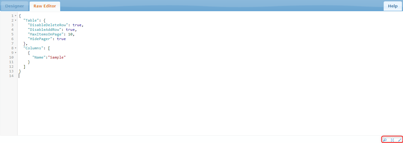
Column configuration:
Search configuration:{ "Table": { "MaxItemsOnPage": 10 }, "Columns": [ { "Id": "town", "Name": "Název" }, { "Name": "Částka" } ] }[ { "InputName": "Title", "FieldInternalName": "Title" }, { "InputName": "SampleTable", "FieldInternalName": "SampleTable", "ItemCompareType": "TABLE_COLUMN_BEGINS_WITH", "ColumnId": "town" } ] -
LIKE
-
ColumnId
"ColumnId": "MyColumn1"
Advanced Table column id. -
InputName
"InputName": "s_invoiceBarcode"
HTML element Id.internally used by jQuery '#id' selection.
-
AlternateFields
Multiple columns search.
Multiple columns search.Alternative search columns, joined by 'or' condition over all columns specified, use the same properties excluding common InputName property.
-
SubCondition
Sub conditions.If you need to search.
{
    "ConcatAsOr": true,
    "Condition1":{
      "ConcatAsOr": true,
      "Condition1":{
        "InputName":"ValiditySince",
        "FieldInternalName":"Siso_ValidSince",
        "SearchType":"Date",
        "ItemCompareType":"LOWER_INCLUDE",
        "SubCondition":
        {
          "FieldInternalName":"Siso_ValidTo",
          "SearchType":"Date",
          "ItemCompareType":"GREATER_INCLUDE",
          "AllowNull": true
        }
      },
      "Condition2":{
        "InputName":"ValidityTill",
        "FieldInternalName":"Siso_ValidTo",
        "SearchType":"Date",
        "ItemCompareType":"GREATER_INCLUDE",
        "AllowNull": true,
        "SubCondition":
        {
          "FieldInternalName":"Siso_ValidSince",
          "SearchType":"Date",
          "ItemCompareType":"LOWER_INCLUDE"
        }
      }
    },
    "Condition2": {
      "ConcatAsOr": false,
      "Condition1":{
        "InputName":"ValiditySince",
        "FieldInternalName":"Siso_ValidSince",
        "SearchType":"Date",
        "ItemCompareType":"LOWER_INCLUDE"
      },
      "Condition2": {
        "InputName":"ValidityTill",
        "FieldInternalName":"Siso_ValidTo",
        "SearchType":"Date",
        "ItemCompareType":"GREATER_INCLUDE",
        "AllowNull": true
      }
    }
}-
DisableCollapse
If set to true the table will be opened on load -
ConcatAsOr
Used to fuse multiple conditions together. If set to true the two conditions are fused through OR. If set to false the two conditions are fused through AND. -
AllowNull
Enables for sql queries to return values that are equal to null as well instead of only empty values
Result items
Result columns definition, column internal names, types and table header.
[
  {
    "FieldInternalName":"s_invoiceBarcode",
    "ColumnHeader":"Barcode",
    "OrderBy":"asc"
  },
  {
    "FieldInternalName":"s_invoiceNumber",
    "ColumnHeader":"Invoice number"
  },
  {
    "FieldInternalName":"s_supplierName",
    "ColumnHeader":"Supplier name"
  },
  {
    "FieldInternalName":"s_supplierTaxIdentNumber",
    "ColumnHeader":"Tax Ident"
  },
  {
    "FieldInternalName":"s_variableSymbol",
    "ColumnHeader":"Variable symbol"
  },
  {
    "FieldInternalName":"s_orderNumber",
    "ColumnHeader":"Order/contract number"
  },
  {
    "FieldInternalName":"s_invoicePaymentDate",
    "ColumnHeader":"Payment date",
    "ColumnType":"Date"
  }
]
-
FieldInternalName
"FieldInternalName": "InternalNameSampleField"
Internal column name. -
ColumnHeader
"ColumnHeader": "Column1 text"
Column header. -
ColumnType
"ColumnType": "Text", "Number", "YesNo", "TiSaTable", "TiSaLookup", "Custom", "Date", "Currency"
Type of item displayed in result column.Used for result column formatting.
-
ColumnFilterMode
"ColumnFilterMode": "Auto", "Text", "DropDown", "Select", "SelectMulti", "Range"
Type of filter control.Used for result column filtering.
-
ColumnFilterDir
"ColumnFilterDir": "asc", "desc"
Defines the direction of sorting values in the filter. -
OrderBy
"OrderBy": "asc/desc"
Result order asc (ascending A-Z) or desc (descending Z-A). -
Expression
"Expression": "{value}.split('#').pop()"
-
CustomRenderFunction
"CustomRenderFunction": "RenderCustomOrders",
Enables to use custom function to render search results, for example data from Advanced Table. Script can be defined in HTML template. -
DisableView
Column is not displayed in search result. Used when more data needs to be exported than shown in the results. -
DisableExport
"DisableExport": true
Column is not displayed in export to csv. -
DisableFilter
"DisableFilter":true
Disables filtering - RenderOptions
-
DisplayLink
"DisplayLink": true
Displays link to item in result table. - EditLink
Result column with expression:
[
  {
    "FieldInternalName":"Archive_DocumentType",
    "Expression":{
      "Formula":"'{value}'.replace(/;#/g,' – ')"
    }
  }
]
Examples
Date range
To set search filter between two dates
Template
<input type="hidden" id="Created" name="Created" />
<input id="CreatedFrom" name="CreatedFrom" class="datePicker" data-dateFormat="d. m. yy" data-multiValue="Created" data-multiValueIndex="1" locale="1" />
-
<input id="CreatedTill" name="CreatedTill" class="datePicker" data-dateFormat="d. m. yy" data-multiValue="Created" data-multiValueIndex="2" locale="1" />
Form items
{
    "InputName":"Created",
    "FieldInternalName":"Created",
    "SearchType":"Date",
    "ItemCompareType":"BETWEEN"
}
Price range
To set search filter between numbers
Template
<tr>
  <td>
    <label for="s_totalCost">
      Total costs:
    </label>
  </td>
  <td>
    <input type="text" id="s_totalCost1" name="s_totalCost1" class="verysmall" />
    -
    <input type="text" id="s_totalCost2" name="s_totalCost2" class="verysmall" />
  </td>
</tr>
Form items
{
    "Condition1":{
      "InputName":"s_totalCost1",
      "FieldInternalName":"s_totalCost",
      "SearchType":"Number",
      "ItemCompareType":"GREATER_INCLUDE"
    },
    "Condition2":{
      "InputName":"s_totalCost2",
      "FieldInternalName":"s_totalCost",
      "SearchType":"Number",
      "ItemCompareType":"LOWER_INCLUDE"
    }
  }
Search by Year and Month
To enable filtering by year and month.

The fillYears class generates years within a range defined by the data-Range attribute. The fillMonths class generates months, and the display format can be optionally set in the attribute. If no format is provided, the default format is MMMM. If no month is set, the search is performed only by year.
- MMMM – full month name
- MMM – abbreviated name
- M, MM – month number
Template
<tr>
  <td>
    <label>
      Created in year / month:
    </label>
  </td>
  <td>
    Year: <select id="Created_Year" name="Created_Year" class="fillYears" data-Range="2017-2030"></select>   Month: <select id="Created_Month" name="Created_Month" class="fillMonths" data-Format="MM"></select>
  </td>
</tr>
Form items
{
  "InputName":"Created_Year",
  "FieldInternalName":"Created",
  "ItemCompareType":"DATETIME_YEAR"
 },
 {
  "InputName":"Created_Month",
  "FieldInternalName":"Created",
  "ItemCompareType":"DATETIME_MONTH"
 }
ExternalLookup support
Search supports ExternalLookup add-in field. You can set search dropdown based on external source
data-SourceType: ExternalLookup, ManageMetadata, Choice, AdvancedChoice
There is dependency support for dependent ExternalLookups.
Template
<script type="text/javascript">
    window._Company = {
    "DataSourceType": "SP",
    "DataSourceConfiguration": {
    "SourceList":"{SiteUrl}/Company"
    },
    "IndexValue": {
    "Expression":"{ID}"
    },
    "TextValue":{
    "Expression":"{Title}"
    },
    "SearchLimit": 1000
    };
</script>
<div class="formColumn">
    <table>
        <tr>
            <td>
                <label for="Contract_Company">
                [FieldResource:Contract_Company]:
                </label>
            </td>
            <td>
                <select id='Contract_Company' name='Contract_Company' class="externalLookup" data-SourceType="ExternalLookup" data-Config="_Company" data-valueSufix="#;" data-EmitEmptyItem="1" />
            </td>
        </tr>
    </table>
</div>
Search in AdvancedTable column
Template
<label for="Title">
    Title
</label>
<input id="Title" name="Title" />
<br>
<label for="ReferenceTest">
    ReferenceTest: MyTextColumn (begins)
</label>
<input id="ReferenceTest" name="ReferenceTest" />
<br>
<label for="ReferenceTest2">
    ReferenceTest: MyTextColumn (eq)
</label>
<input id="ReferenceTest2" name="ReferenceTest2" />
<br>
<label for="ReferenceTest3">
    ReferenceTest (like)
</label>
<input id="ReferenceTest3" name="ReferenceTest3" />
Form items
[
  {
    "InputName":"Title",
    "FieldInternalName":"Title"
  },
  {
    "InputName":"ReferenceTest",
    "FieldInternalName":"ReferenceTest",
    "ItemCompareType": "TABLE_COLUMN_BEGINS_WITH",
    "ColumnId": "MyTextColumn"
  },
  {
    "InputName":"ReferenceTest2",
    "FieldInternalName":"ReferenceTest",
    "ItemCompareType": "TABLE_COLUMN_EQ",
    "ColumnId": "MyTextColumn"
  },
  {
    "InputName":"ReferenceTest3",
    "FieldInternalName":"ReferenceTest",
    "ItemCompareType": "TABLE_LIKE"
  }
]
Result columns
[
  {
    "FieldInternalName":"Title"
  },
  {
    "FieldInternalName": "ReferenceTest",
    "ColumnType": "TiSaTable"
  }
]
Search in user column
Template
<label for="Author">
    Author
</label>
<input id="Author" name="Author" class="userPicker" />
Form columns
[
  {
    "InputName":"Author",
    "FieldInternalName":"Author",
    "ItemCompareType": "USER"
  }
]
Result columns
[
  {
    "FieldInternalName":"Author"
  },
]
Search in user column including groups
The user input can optionally have a "data-PrincipalType" attribute where the search area can be set. If no attribute is defined, only the user can be selected. Multiple types can be defined in the attribute, separated by the '|' character.
- User - users
- SecurityGroup - AD/AAD groups
- SharePointGroup - groups of the web collection in SharePoint (to view SP groups, you must have appropriate permissions, or you must have SystemUserName/SystemUserPassword global variable set)
Template
<label for="Author">
    Author
</label>
<input id="Author" name="Author" class="userPicker" data-PrincipalType="User|SecurityGroup|SharePointGroup"/>
Form columns
[
  {
    "InputName":"Author",
    "FieldInternalName":"Author",
    "ItemCompareType": "USER"
  }
]
Result columns
[
  {
    "FieldInternalName":"Author"
  },
]
Resources for tabs
Add custom script to html template, in Search webpart configuration set Form name as RESX.SearchBasic.
<script type="text/javascript">
    {
    // tyto resource se aplikují na všechny záložky
    var commonResources = {
      "cs-CZ":{
        "SearchBasic": "Vyhledávání základní",
        "SearchDefault": "Vyhledávání",
        "SearchDuedateClose": "Faktury před splatností",
        "SearchDuedatePassed": "Faktury po splatnosti",
        "Section_Header": "Hlavička faktury",
        "Section_Supplier": "Dodavatel",
        "Section_Date": "Datumy",
        "Help_FullDate": "(RRRR-MM-DD)",
        "Help_YearAndMonth": "rok a měsíc",
        "Label_DUZP": "DUZP"
      },
      "en-US":{
        "SearchBasic": "Basic search",
        "SearchDefault": "Search",
        "SearchDuedateClose": "Invoices – duedate close",
        "SearchDuedatePassed": "Invoices – duedate passed",
        "Section_Header": "Invoice header",
        "Section_Supplier": "Supplier",
        "Section_Date": "Date information",
        "Help_FullDate": "(YYYY-MM-DD)",
        "Help_YearAndMonth": "year an month",
        "Label_DUZP": "Date of taxable supplies"
      }
    }
    var RESX = commonResources[_tisaPageInfo.SPLanguage];
    if (!RESX)
      RESX = commonResources["en-US"];
    $(document).ready(function(){
      $("[data-commonResource]").each(function(){
        var element = $(this);
        var key = element.attr("data-commonResource");
        var text = RESX[key];
        if (text)
          element.text(text);
      });
      $(".ui-tabs-anchor").each(function(){
        var element = $(this);
        var id = element.text();
        if (id.indexOf("RESX.") == 0)
        {
          var text = eval(id);
          if (text)
            element.text(text);
        }
      });
    });
  }

  function showTab(idx)
  {
    $( ".tabContainer" ).tabs( "option", "active", idx);
  }
</script>
Print templates definitions
Prevent content to be overwritten via import – prevents content to be overwritten by import or by agenda update.
Print templates supports commands like:
- Get Global Variable value
- Get Web, List, Item and field properties
- Get Field value
- template processing supports(conditions, loops, etc)
Commands are in SGML format prefixed by $.
Basic configuration
HTML template:
<style type="text/CSS">
  h1 {
    text-align: left;
    font-size: 200%;
    padding:5px 5px 5px 18px;
    color:#000;
    margin: 0;
  }
  .templateContent table{
    font-family: Arial, Helvetica, sans-serif;
    width:100%;
    border-collapse: collapse;
  }
  .templateContent table td{
    border-top: 1px solid black;
    border-width:1px;
    padding:10px;
  }
	.columnName {
	font-weight:bold;
  }
</style>
<h1>Contract</h1>
<table class="table templateContent" style="margin-top:20px;">
  <tr>
    <td class="columnName"><$Resource::Contract_Name /></td>
    <td><$FieldValue::Contract_Name /></td>
  </tr>
  <tr>
    <td class="columnName"><$Resource::Contract_RevisionScheduled /></td>
    <td><$FieldValue::Contract_RevisionScheduled Format="dd. MM. yyyy"/></td>
  </tr>
    <tr>
    <td class="columnName"><$Resource::Contract_Solver /></td>
    <td><$FieldValue::Contract_Solver /></td>
  </tr>
    <tr>
    <td  class="columnName" style="vertical-align: top;" ><$Resource::Contract_ChangeLog /></td>
    <td><$FieldValue::Contract_ChangeLog Format="Html" /></td>
  </tr>
</table>
Configuration:
-
Disabled
"Disabled": true,
Disables current template. This template is not visible in the templates menu. -
Groups
"Groups":["SP_Group_Name","Second_SP_Group_Name"]
Specific SharePoint groups can be added. The current print template will be exclusively visible to users of these designated groups. -
Lists
"Lists":["/sites/agenda_name/library_name", "/sites/agenda_name/Lists/list_name"]
Specific sharepoint library or list can be added. The current print template will only be visible within the designated libraries or lists. -
ContentTypes
"ContentTypes": ["content_type_name", "content_type_name_two"]
Specific content type can be added. The current print template will only be visible on items that have the designated content type.
{
  "Disabled":true,
  "Groups":[
  "SP_Group_Name"
  ],
  "Lists":[
  "/sites/agenda_name/library_name"
  ],
  "ContentTypes":[
    "Contracts"
  ]
Example
Print of selected column from SQL table with date formatting:
<hr>
<$FieldValue::Title />
<hr />
<style type="text/css">
  table td { padding: 6px;}
</style>


<$ExternalLookupSource
   Name="source1"
   Type="MSSQL"
   Configuration="|{"TargetObject": "[TestOrders_Wf_Tasks]", "ConnectionString": "$GlobalVariable::DBConnectionString"}"
   Sort="[Id] DESC"/>

<$If Value1="{Source::source1}" Value2="0" Operator="Greater" DataType="Number">
  <table>
    <$ExternalLookupIterator Source="source1" >
      <tr>
        <td><$Value Name="Title" /></td>
        <td><$Value Name="Status" /></td>
        <td><$Value Name="Priority" /></td>
        <td><$Value Format="M. d. yyyy" Name="StartDate" DataType="DateTime"/></td>
      <tr/>
      </$ExternalLookupIterator>
  </table>
</$If>-
ExternalLookup
Print template supports every function of external lookup -
Value
gets values from specified database table in sql-
Name
Internal name of the column we wish to print -
DataType
specifies expected data type of selected column. Can be Integer, Decimal or DateTime. -
Format
Can be used only in combination with 'DataType="DateTime"'. Can be used to format date.
-
Name
Event receivers
Used to set up scripts based on events
Adding receiver
Ext_CountedColumn_AddReceiver "Lists/ATtest"
Ext_CountedColumn_AddReceiver "TestDocLib"
Removing receiver
Ext_CountedColumn_RemoveReceiver "Lists/ATtest"
Ext_CountedColumn_RemoveReceiver "TestDocLib"
Configuration
-
CountedColumn
If an item is saved or if an item is added in a counted column a configurated action will take placefunction Ext_CountedColumn_AddReceiver([string]$listSiteRelativeUrl) { [TiSp.TiSaExtensions.Utility]::CountedColumn_AddReceiver((Ext_EnsureList $listSiteRelativeUrl)) } function Ext_CountedColumn_RemoveReceiver([string]$listSiteRelativeUrl) { [TiSp.TiSaExtensions.Utility]::CountedColumn_RemoveReceiver((Ext_EnsureList $listSiteRelativeUrl)) }
-
ItemCopyData
If an item is saved or if an item is added data will be copied acording to configurationfunction Ext_CountedColumn_AddReceiver([string]$listSiteRelativeUrl) { [TiSp.TiSaExtensions.Utility]::CountedColumn_AddReceiver((Ext_EnsureList $listSiteRelativeUrl)) } function Ext_CountedColumn_RemoveReceiver([string]$listSiteRelativeUrl) { [TiSp.TiSaExtensions.Utility]::CountedColumn_RemoveReceiver((Ext_EnsureList $listSiteRelativeUrl)) }
-
ContentTypeOrder
If an item is saved or if an item is added a content type will be added to configured itemsfunction Ext_ContentTypeOrder_AddReceiver([string]$listSiteRelativeUrl) { [TiSp.TiSaExtensions.Utility]::ContentTypeOrder_AddReceiver((Ext_EnsureList $listSiteRelativeUrl)) } function Ext_ContentTypeOrder_RemoveReceiver([string]$listSiteRelativeUrl) { [TiSp.TiSaExtensions.Utility]::ContentTypeOrder_RemoveReceiver((Ext_EnsureList $listSiteRelativeUrl)) }
-
ContentTypeIndex
If an item is saved or if an item is added selects the order of content types as configuredfunction Ext_ContentTypeIndex_AddReceiver([string]$listSiteRelativeUrl) { [TiSp.TiSaExtensions.Utility]::ContentTypeIndex_AddReceiver((Ext_EnsureList $listSiteRelativeUrl)) } function Ext_ContentTypeIndex_RemoveReceiver([string]$listSiteRelativeUrl) { [TiSp.TiSaExtensions.Utility]::ContentTypeIndex_RemoveReceiver((Ext_EnsureList $listSiteRelativeUrl)) }
-
AdvancedTable
If an item is saved or if an item is added in a referencial table a configured action will be takenfunction Ext_AdvancedTable_AddReceiver([string]$listSiteRelativeUrl) { [TiSp.TiSaExtensions.Utility]::AdvancedTable_AddReceiver((Ext_EnsureList $listSiteRelativeUrl)) } function Ext_AdvancedTable_RemoveReceiver([string]$listSiteRelativeUrl) { [TiSp.TiSaExtensions.Utility]::AdvancedTable_RemoveReceiver((Ext_EnsureList $listSiteRelativeUrl)) }
Example
Add-PsSnapin Microsoft.SharePoint.PowerShell -ErrorAction SilentlyContinue
[System.Reflection.Assembly]::LoadWithPartialName("TiSp.TiSaExtensions") | Out-Null
$SiteUrl = "https://SiteURLsample.com"
function Ext_EnsureList([string]$listSiteRelativeUrl){
$w = Get-SPWeb $SiteUrl
$l = $w.GetList($w.ServerRelativeUrl.TrimEnd("/") + "/" + $listSiteRelativeUrl)
return $l
}
function Ext_CountedColumn_AddReceiver([string]$listSiteRelativeUrl)
{
	[TiSp.TiSaExtensions.Utility]::CountedColumn_AddReceiver((Ext_EnsureList $listSiteRelativeUrl))
}
function Ext_CountedColumn_RemoveReceiver([string]$listSiteRelativeUrl)
{
	[TiSp.TiSaExtensions.Utility]::CountedColumn_RemoveReceiver((Ext_EnsureList $listSiteRelativeUrl))
}
function Ext_ItemCopyData_AddReceiver([string]$listSiteRelativeUrl)
{
[TiSp.TiSaExtensions.Utility]::ItemCopyData_AddReceiver((Ext_EnsureList $listSiteRelativeUrl))
}
function Ext_ItemCopyData_RemoveReceiver([string]$listSiteRelativeUrl)
{
[TiSp.TiSaExtensions.Utility]::ItemCopyData_RemoveReceiver((Ext_EnsureList $listSiteRelativeUrl))
}
function Ext_ContentTypeOrder_AddReceiver([string]$listSiteRelativeUrl)
{
	[TiSp.TiSaExtensions.Utility]::ContentTypeOrder_AddReceiver((Ext_EnsureList $listSiteRelativeUrl))
}
function Ext_ContentTypeOrder_RemoveReceiver([string]$listSiteRelativeUrl)
{
	[TiSp.TiSaExtensions.Utility]::ContentTypeOrder_RemoveReceiver((Ext_EnsureList $listSiteRelativeUrl))
}
function Ext_ContentTypeIndex_AddReceiver([string]$listSiteRelativeUrl)
{
	[TiSp.TiSaExtensions.Utility]::ContentTypeIndex_AddReceiver((Ext_EnsureList $listSiteRelativeUrl))
}
function Ext_ContentTypeIndex_RemoveReceiver([string]$listSiteRelativeUrl)
{
	[TiSp.TiSaExtensions.Utility]::ContentTypeIndex_RemoveReceiver((Ext_EnsureList $listSiteRelativeUrl))
}
function Ext_AdvancedTable_AddReceiver([string]$listSiteRelativeUrl)
{
	[TiSp.TiSaExtensions.Utility]::AdvancedTable_AddReceiver((Ext_EnsureList $listSiteRelativeUrl))
}
function Ext_AdvancedTable_RemoveReceiver([string]$listSiteRelativeUrl)
{
	[TiSp.TiSaExtensions.Utility]::AdvancedTable_RemoveReceiver((Ext_EnsureList $listSiteRelativeUrl))
}
# remove receivers
Ext_CountedColumn_RemoveReceiver "Lists/ATtest"
Ext_CountedColumn_RemoveReceiver "TestDocLib"
# add receivers
Ext_CountedColumn_AddReceiver "Lists/ATtest"
Ext_CountedColumn_AddReceiver "TestDocLib"Form definition
Main features
- Form fields definition
- Tabs and collapsable groups support
- Multiple form columns
- Field properties (mandatory, read only, validation)
- Alternative forms (conditional)
- Document preview split window
- Metadata print HTML templates
- Javascript support
- Metadata based permissions support
- Custom form ribbons
- Filling service
- Field context help
Basic configuration
The basic definition for all fields of the content type can be generated in the left part of the form using the Show fields button.
{
  "Groups": [
    {
      "HideGroupHeader": true,
      "Fields": [
        {
          "InternalName": "Title"
        },
        {
          "InternalName": "AnotherInternalNameField"
        }
      ]
    }
  ]
}-
ShowValidationSummary
"ShowValidationSummary": false
Shows validation error summaryUseful for large forms, user gets simple error overview even for fields outside of visible part of form.
-
HiddenCommands
It is a hidden string to add commands in -
DeleteOnCancel
Clicking the cancel button will delete the whole item (rather for dynamic use) -
Display
changes the visual aspects of form-
FullWidth
stretches the form to the full width
-
FullWidth
-
FocusSelector
"FocusSelector": false
Set focus to specific HTML input element, defined by JQuery selector.tisa-form-rowSomeField input:first
-
DisplayGroupsAsTabs
"DisplayGroupsAsTabs": false
Groups displayed as tabsFields are composed into groups by default displayed as collapsable section use DisplayGroupsAsTabs: true to render tabs instead of collapsable rows sections.
-
Redirect
"ShowValidationSummary": false
Enables redirection after saving the item. Either can redirect to a folder, or can redirect to a custom url, defined using replace tokens{ "Redirect": { "OpenFolder": true, "CustomUrl": "{SiteUrl}{WebUrl}{NewItemRootFolder}{FileLeafRef}" } }To open a page from another page (in a dialog), the tisa.appparts interface can be used.
1. adding links to ScriptEditor
<a class="tisa-link" href="{WebUrl}/DocumentSetTest/Forms/Upload.aspx?ContentTypeId=0x01200038DC085D4741814D871172FE7C99B6C6" data-dialog="true"><img src="{SiteUrl}/SiteAssets/Contracts/Img/contract.png"><h3>Open in dialog</h3></a>
<a class="tisa-link" href="{WebUrl}/DocumentSetTest/Forms/Upload.aspx?ContentTypeId=0x0120"><img src="{SiteUrl}/SiteAssets/Contracts/Img/contract.png"><h3>{TiSa:CreateFolder}</h3></a>
2. adding scripts via ContentEditor
<SiteServerRelativeUrl>/SiteAssets/TiSa/_Shared/tisa.appparts.htmlSaveAndReload
Saves and refreshes the page instead of returning to the main page -
DisplayWaitDialog
"DisplayWaitDialog": false
Shows wait dialog on item save, useful for long save operation -
AutoFormatDateFields
"AutoFormatDateFields": false
Auto formatting date fields -
CustomFormDefinitions
"CustomFormDefinitions": [{},{},{}]
Alternative forms definitions. View different forms based on user role, metadata value, use custom script to view alternative form.{ "Groups": [ { "Name": "Base definition group name", "Fields":[ { "InternalName": "Title", "ReadOnly": true }, { "InternalName": "InternalNamePole" } ] } ], "CustomFormDefinitions": [ { "Name": "FormDefinition1", "Groups": [ { "Name": "Group name for FormDefinition1", "Fields":[ { "InternalName": "Title", "ReadOnly": true }, { "InternalName": "InternalNameFieldAA" } ] } ] }, { "Name": "FormDefinition2", "Groups": [ { "Name": "Group name for FormDefinition2", "Fields":[ { "InternalName": "Title" }, { "InternalName": "InternalNameFieldBB" } ] } ] } ] }
Collapsable groups/Tabs definition
"Groups": [{}, {}, {}] List of groups / tabs
-
Id
Group (tab) IdIf not defined, autogenerated value.
-
Name
Group (tab) nameYou can localize name using Resources property.
-
Collapsed
"Collapsed": false
To show collapsable group collapsed set true valid on form open. This way you set initial section state. -
HideGroupHeader
"HideGroupHeader": false
Set true to hide group (tab) name.useful if there is only one group on form.
-
HideFieldNames
"HideFieldNames": false
Hides field display name (label)Use if group name is used as field label. Sometimes used for custom Ti4Sp table field with workflow history.
-
ColumnSpan
"ColumnSpan": null
Span cells on row. For "HideFieldNames": true we recommend value 2. -
NameFromFirstFieldName
"NameFromFirstFieldName": false
Group (tab) name by first field in group display name. -
NameFromFieldName
"NameFromFieldName": false
Group (tab) name by defined field display name. -
CSSClass
"CSSClass": "gCommonFields"
Group (tab) CSS class used for HTML formatting. -
CSSStyle
"CSSStyle": "color:red; font-weight:bold; font-style:italic; text-decoration:underline"
Group (tab) style attributes. -
CSSClassHeader
"CSSClassHeader": "gCommonFieldsHeader"
Group name CSS class name. -
CSSStyleHeader
"CSSStyleHeader": "color:red; font-weight:bold; font-style:italic; text-decoration:underline"
Group name style attributes. -
Fields
"Fields": [{}, {}, {}]
List of fields in group{ "Groups": [ { "Name": "Group1 name", "HideColumnHeaders": true, "Columns": [ { "Id": "c1" }, { "Id": "c2" } ], "Fields":[ { "InternalName": "Title", "ReadOnly":true }, { "InternalName": "InternalNamePole", "Required": true }, { "InternalName": "InternalName_PoleVeSloupci2", "TargetColumn": "c2" } ] } ] }
Standard field definition
-
InternalName
"InternalName": "InternalNameSampleField"
Internal (static) field name.Inserts field into specific group on form.
-
AllowBulkApproval
"AllowBulkApproval": false
If true, mark field for bulk approval. -
Required
"Required": false
If true, field is mandatory.Form validation on save warns user if field is empty.
-
Hidden
"Hidden": false
If true, field is hidden. -
ReadOnly
"ReadOnly": false
Read only field true, cannot be modified. -
CSSClass
"CSSClass": "fSampleField"
Field CSS class name for style formatting. -
Validation
-
Validator *
"Validator": "regex"
Validation type.- required – Mandatory field. The same as property "Required": true.
- equal – Equals to defined value.
- startswith – Entered value starts with defined text.
- endswith – Entered value ends with defined text.
- contains – Entered value contains defined text.
- regex – Regular expression validator.
- number – Entered value is number in defined ranged.
- date – Entered value is date in defined ranged.
{ "InternalName": "DateOfTaxableSupplies", "Validation":{ "Validator": "date", "ValidateOnlyChanges": true, "Expression": "{today}-7d|{today}+7d", "ErrorMessage":"Enter date in from {From} to {To} range" } } -
Expression
Sets the expression against which the value in the field is compared. It is possible to define a range for some validators.-
date – Expression allows you to set both a beginning and an end, separated by |.
Definition of scope:only the initial date: "{today}-7d"
target number date: "|{today}+7d"
initial and target date: "{today}-7d|{today}+7d"
The value shall be given in ISO format.exact date in ISO format: '2020-12-01|2020-12-31'
replace tokens "{today}|{today}+7d"
offset (date can be added or subtracted) "{today}|{today}+7d+5h"
replace tokens – {now}, {today}, {value}, {year}, {year-month}
offset tokens: y – year, M – month, w – week, d – day, h – hour, m – minute, s – second
Example:date 7 days back and 7 days forward from the current date: "{today}-7d|{today}+7d"
cannot insert an earlier date than the one filled in and the maximum is the current date + week: "{value}|{today}+w"
can only be entered in the specified range: "2020-12-01|2020-12-31" -
number – Expression allows you to set both a beginning and an end, separated by |.
Definition of scope:
only the initial number: "10"
target number only: "|20"
initial and target number: "10|20" - regex – In Expression there is a regular expression with which the value is compared
- startswith, endswith, contains, equals, contains – In Expression is the string against which the value is compared. The Validator can be set programmatically by a script so that the Expression value can be affected based on the state of the form.
var ct = formContext.FindFieldControl("myField"); var validator = TiSa.Forms.Utils.GetValidatorByType(ct.Validators,"equal"); validator.SetDisabled(false); validator.SetExpression("Value123"); validator.SetErrorMessage("Field does not have the correct value, expected value is Value123"); -
date – Expression allows you to set both a beginning and an end, separated by |.
-
ErrorMessage *
"ErrorMessage": "Value is not valid."
Text of validation error message. -
Disabled
"Disabled": false
Disable validation.Allows disable/enable validation in custom script. Using this property true/false you can set initial state.
-
ValidateOnlyChanges
"ValidateOnlyChanges": false
Set true to validate only on value changed.You can for example validate date against current date and validation cannot be used on later modification of item.
-
Validator *
Empty row and special elements definition
-
EmptyElement
"EmptyElement": false
Emits empty element -
Content
-
Fields
Generates form fields -
Html
"Html": "HTML text to be embed in form"
Static text -
Folder
Generate folder content as attachment field or to view the contents of a folder on form.
{ "EmptyElement" : true, "Content":{ "Folder": { "FolderContent":{ "Query": "<OrderBy><FieldRef Name=\"FSObjType\" /><FieldRef Name=\"Modified\" /></OrderBy>" }, "IncludeFolders": true, "ViewFileIcon": true, "EnableOpen": true, "EnableView": true, "MaxItemsOnPage": 25, "DisplayAuthor": true, "DisplayCreated": true, "DisplayContentType": true, "DisplayFields": [ "FileLeafRef", "Level", "DocumentName", "Department" ] } } } -
Fields
-
DocumentLink
"DocumentLink": false
Generates document link. -
"ContentTypeSelector": false
"ContentTypeSelector": false
Generates content type selector dropdown list. -
HiddenField
Renders special form fields, not editable or not visible in new form.{ "HiddenField": "Author", "Title": "autor" }{ "HiddenField": "Created", "Title": "created", "IncludeTime" : true }{ "HiddenField": "_UIVersionString", "Title": "version" } -
IncludeTime
"IncludeTime": false
Shows time part of date next to the date part. Valid for date with time fields -
TasksTable
Displays current active tasks on current item in a table-
ShowWorkflow
Displays the internal name of the workflow in a separate column
{ "Title":"Active tasks", "TasksTable":{ "ShowWorkflow":true } } -
ShowWorkflow
Document preview
For document items, you can preview document content (browser support required).
Preview setup can be user based using property "UserLayout".
 {
  "UserLayout":{
    "DocumentPreview": true
  },
  "DocumentPreview":{
    "DelayDisplay": 5000,
    "DisplayGroups":[
      {
        "Extensions": ".pdf|.txt",
        "PreviewUrl": "{FilePath}"
      }
    ]
  }
}
-
DelayDisplay
"DelayDisplay": 1000
Specify delay before preview is generated (milliseconds). -
DisplayStateInitial
"DisplayStateInitial": 0
Initial form view. 0 = form; 1 = document preview; 2 = split form and doc preview -
SpinnerInitial
"SpinnerInitial": 50
Split in percent. -
SpinnerMin
"SpinnerMin": 10
Minimal split in percent. -
SpinnerMax
"SpinnerMax": 90
Maximal split in percent. -
DisplayGroups
"DisplayGroups": []
Define groups of documents by extension.-
Extensions *
Format of the previewed file
Supported formats:- .txt,.pdf,.docx – Usually used with PreviewUrl set to '{FilePath}'. Does not work correctly in combination with PreviewUrl se to 'direct'
- .html,.png,.jpg,.gif,.mp4 etc. – For correct display the property PreviewUrl have to be set to 'direct'
-
PreviewUrl *
document url, use tokens {FilePath}, direct. Alt use owa, owa_edit, wopi, wopi_edit, oos, oos_edit (if oos_edit is selected the document must be edited in dispForm otherwise save conflict will occur) OpenTextBrava for office docs.Depending on the type of OneDrive usage, the names must not contain the characters mentioned in the attached link:
https://support.microsoft.com/en-us/office/restrictions-and-limitations-in-onedrive-and-sharepoint-64883a5d-228e-48f5-b3d2-eb39e07630fa?ui=en-us&rs=en-us&ad=us -
ClickCommand* *
Click event for open
-
Extensions *
-
UseAttachmentField
"UseAttachmentField": AttachmentFieldInternalName
Use attachment field for preview.
Ribbon buttons/commands
You can define custom ribbon commands for ribbon or form. Command can start workflow or custom form js actions etc.
"RibbonButtons":[
  {
    "Title":"Cancel",
    "ToolTipDescription":"Order cancel",
    "Icon":"{SiteCollectionUrl}/SiteAssets/cancel.png",
    "GroupTitle":"Workflows",
    "GroupId":"workflow",
    "EnabledFunction":"BtnCancelEnabled",
    "VisibleFunction":"BtnCancelVisible",
    "CommandFunction":"BtnCancelCommand"
  },
  {
    "Title":"Send",
    "ToolTipDescription":"Send to process",
    "Icon":"{SiteCollectionUrl}/SiteAssets/send.png",
    "GroupTitle":"Workflows",
    "GroupId":"workflow",
    "EnabledFunction":"BtnSendEnabled",
    "VisibleFunction":"BtnSendVisible",
    "CommandFunction":"BtnSendCommand"
  }
]
Button object attributes
-
Title
Button name -
ID
Unique identification number of the button -
GroupId
Group ID. If not defined generated automatically. To display more buttons in single group you must define GroupId. -
GroupTitle
Title of group commands. -
ToolTipTitle
Header value of the bubble that appears when hovering over the button with cursor -
ToolTipDescription
Content of the bubble that appears when hovering over the button with cursor -
Icon
"Icon": _layouts/15/images/placeholder32x32.png
Url path to the button icon. -
Visible
"Visible": true
Button visibility. -
CommandFunction
JS function name to be executed when the button is clicked. -
EnabledFunction
JS function name, function returns true/false to enable/disable button. If the function is not defined the button will remain always active. -
GroupSequence
Group order for multiple group definitions.
Definition of the button press event and function of the activation/deactivation of the button:
function TiSaForm_Customize(cfg) {
  this.OnFormInit = function(form) {
    form.OnAction("BtnCancelCommand", function(completeCallback) {
      WFEngine.Manager.StartWorkflowOnItem("Storno", form.ItemId);
    });
  };
}

function BtnCancelCommand(obj, form) {
  if (confirm("Do you really want to cancel?"))
    form.ActionStart("BtnCancelCommand", true);
}

function BtnCancelEnabled(obj, form) {
  var s_author = form.FormContext.FieldsByName.s_author;
  var s_specialist = form.FormContext.FieldsByName.s_specialist;
  var isAuthor = s_author.GetValue() && s_author.GetValue().indexOf(_spPageContextInfo.userLoginName) >= 0;
  var isSpecialist = s_specialist.GetValue() && s_specialist.GetValue().indexOf(_spPageContextInfo.userLoginName) >= 0;

  if (!form.IsNewForm && isAuthor && form.FormData.s_status !== 'inApproval')
    return true;
  if (!form.IsNewForm && isSpecialist && form.FormData.s_status == 'returned')
    return true;
}
Metadata print
Enables ribbon button for printing. Print templates are defined in TreeINFO configuration here.
{
    "Print":{}
}
Copy / Clone
Copy current Item.
{
  "Copy": {
    "TargetList": "{WebUrl}/Orders",
    "ExceptFields":[
      "Title",
      "s_author",
      "s_approvalStart",
      "s_finalApprovalDate",
      "s_status",
      "s_approvalProcessHistory"
    ]
  }
}
-
TargetList
Define list where copy will be saved. -
ExceptFields
Define fields that will not be copied.
Role assigements
This functionality allows to define permissions on form.
"Extensions":{
  "Permissions":{
    "CopyRoleAssigements":true,
    "Fields": [
      {
        "InternalName": "_x0055_sr1",
        "PermissionLevel":"Contributor"
      },
      {
        "InternalName": "_x0055_sr2",
        "PermissionLevel":"Reader"
      },
      {
        "InternalName": "UsrTable",
        "ColumnId":"Dodavatele",
        "PermissionLevel":"Reader"
      }
    ],
    "Principals": [
      {
        "PrincipalName": "sabris\test001",
        "PermissionLevel":"Reader"
      },
      {
        "PrincipalName": "{webproperty:test_DomainName}\test001",
        "PermissionLevel":"Reader"
      }
    ]
}-
Permissions *
Adds permissions using event receiver "TasksPermissionsEventReciever" with appropriate name-
CopyRoleAssigements
Copy existing permissions
-
CopyRoleAssigements
-
Fields *
Fields list and corresponding permission. Use SharePoint Person or Group or TiSa AdvancedTable (ColumnId must be defined) columns.-
InternalName *
SharePoint internal field name where permission configuration is stored, -
PermissionLevel
Item permission level. You can use localized permission level, or enum SPRoleType value (see: Documentation) -
ColumnId
mandatory if users are stored in tisa AdvancedTable. Use column Id form Advanced table definition (where user names are stored)
-
InternalName *
-
Principals *
Static user and AD group list, to set permission-
PrincipalName
Ad user or group name. You can use token: {webproperty:test_DomainName} , to get value from web properties value returned for key 'test_DomainName' will be replaced in text. -
PermissionLevel
Item permission level. You can use localized permission level, or enum SPRoleType value (see: Documentation)
-
PrincipalName
Prevent Save Receiver
Special event receiver. Custom event receiver support only specific users can save form values (used for large lists where individual item rights can be set). Receiver compares Field1 and Field2 values if condition is true all users expect user defined in Principals element can save form.
"Extensions": {
  "PreventSaveReciever": {
    "Field1": "inv_PrevStatus",
    "Field2": "inv_NewStatus",
    "Operator": "Eq",
    "Principals": [
      {
        "PrincipalName": "{webproperty:DomainName}\\user1"
      },
      {
        "PrincipalName": "TDEV\\user2"
      }
    ]
  }
On-Premises supported receiver from TiSa.Extension package
-
PreventSaveReciever
receiver config element -
Field1 and Field2
Internal names of fields for comparison -
Operator
Supported Eq or Neq. Field1 Equals to Field2, Field1 not equals to Field2
Filing service
Filing service allows to create document filled with metadata. Document can be created from template or uploaded.
{
  "FileSet":{
    "TemplateFileUrl": "/sites/efa/DocumentsFromTemplate_Templates/DefaultDocument.pdf",
    "AllowUpload": true
  }
}-
TemplateFileUrl
"TemplateFileUrl": true
Relative document template url -
AllowUpload
Allows document upload.
Information – callout
Form can view icon to display information popup callout. Can be used for:
- Field on form
- Group
- Form
Uses standard SharePoint Callout function. Configuration:
- Static – static text
- Dynamic – set callout using custom javascript function
Javascript functions allow you to set all callout component properties.This way you can use all callout features including custom callout action buttons. You can turn hide/display callouts using javascript according to form context or state.
-
CalloutEnabled
true, displays callout icon, otherwise return of function CalloutEnabledFunction decides. If neither is defined icon is not visible. Property CalloutEnabled has higher preference. -
CalloutTitle
Static title, text displayed in callout header. -
CalloutContent
Static callout content, supports HTML formatting. -
CalloutCSSClass
CSS class for callout icon, default value tisa-callout-button-right. Supported classes:- tisa-callout-button-right – right aligned icon
- tisa-callout-button-left – left aligned icon
- any custom class
-
CalloutCSSStyle
Inline CSS style for icon. -
CalloutIcon
Custom icon url, otherwise default icon is used -
CalloutFunction
Javascript function interface, sets callout properties if not static content is used. Function header:
Function parameters:- form – form instance
- cfg – associated element configuration (field / group)
- calloutOptions – CalloutOptions object. For details visit documentation.
function MY_HELP_FUNCTION(form,cfg,calloutOptions) { } -
CalloutEnabledFunction
Function enables/disables to display callout icon. Can be used instead of property CalloutEnabled. Example:
function MY_HELP_ENABLED_FUNCTION(form, field) {
    return form.IsEditForm;
}
Call configuration samples
Field callout:
{
  "Groups": [
    {
      "Fields": [
        {
          "InternalName": "Title",
          "CalloutEnabled": true,
          "CalloutContent": "Callout text eg help, you can use HTML",
          "CalloutTitle": "Help is cool"
        }
      ]
    }
  ]
}
Callout with js script:
{
  "Groups": [
    {
      "Fields": [
        {
          "InternalName": "Title",
          "CalloutEnabledFunction": "MY_HELP_ENABLED_FUNCTION",
          "CalloutFunction": "MY_HELP_FUNCTION"
        }
      ]
    }
  ]
}
Custom script:
function MY_HELP_FUNCTION(form, cfg, calloutOptions) {
  // different callouts for edit and display forms
  if (form.IsEditForm) {
    calloutOptions.title = "callout title on  EDIT form";
    calloutOptions.content = "Content by function on " + (new Date());
  } else {
    calloutOptions.title = "callout title on  DISP form";
    calloutOptions.content = "Content by function on " + (new Date());
  }
}
// to use this function set "CalloutEnabled": false
function MY_HELP_ENABLED_FUNCTION(form, field) {
  return form.IsEditForm; // displays callout on edit form only
}
Automatic redirection of edit/display form to Task Form
$SiteUrl = "<siteurl>"
$w = Get-SPWeb $SiteUrl
$taskCt = $w.ContentTypes | where ID -EQ "0x0108AA"
if($taskCt -ne $null)
{
   $listPages = $w.Lists.EnsureSitePagesLibrary()
   $taskCt.EditFormUrl = $listPages.RootFolder.ServerRelativeUrl + "/TiSa/TaskForm.aspx"
   $taskCt.DisplayFormUrl = $listPages.RootFolder.ServerRelativeUrl + "/TiSa/TaskForm.aspx"
   $taskCt.Update($true)
}
The script above redirects opening of a form to be always Task form even if opened as Edit/Display form
Registration in Online environment is done through TreeINFO user interface:
Settings -> Task forms -> Select WFTask -> Click Associate button
Form scripting
On the "Custom Script" tab, you can create a script to modify the appearance and behavior of the form. Form internally generates a series of events upon initialization and allows custom handlers to be added.
The basis for scripting is a function that receives the form configuration, to which we can add event-responsive functions.
This example shows simple form operations – alternate form definition for display form. You can see how to access form fields and change properties ReadOnly, visibility, get/set values, required.
function TiSaForm_Customize(cfg) {
  this.OnFormInit = function(form) {
    // display form can use alternate configuration
    if (form.IsDisplayForm)
      form.SetFormDefinition("DisplayForm");
  };

  this.OnFormInitComplete = function(form) {
    var formContext = form.FormContext;
    //sample acces form fields, initially all fields are readonl, yuo can change properties and values here.
    var cts_invoiceNumber = formContext.FindFieldControl("s_invoiceNumber");
    var cts_supplierLookup = formContext.FindFieldControl("s_supplierLookup");
    var cts_invoicePaymentDate = formContext.FindFieldControl("s_invoicePaymentDate");
    var cts_invoiceDueDate = formContext.FindFieldControl("s_invoiceDueDate");
    var cts_invoiceDUZP = formContext.FindFieldControl("s_invoiceDUZP");
    var cts_status = formContext.FindFieldControl("s_status");
    var cts_author = formContext.FindFieldControl("s_author");
    var cts_authorDepartment = formContext.FindFieldControl("s_authorDepartment");
    // change column settings according to the value
    if (cts_status.GetValue() == "new") {
      cts_invoiceNumber.SetReadOnly(false);
      cts_invoiceNumber.SetRequired(true);
      cts_supplierLookup.SetReadOnly(false);
      cts_invoicePaymentDate.SetReadOnly(false);
      cts_invoiceDueDate.SetReadOnly(false);
      cts_invoiceDueDate.SetRequired(true);
      cts_invoiceDUZP.SetReadOnly(false);
      cts_invoiceDUZP.SetRequired(true);
    }
    //setting current user to field
    if (form.IsNewForm) {
      cts_author.SetValue(_spPageContextInfo.userId);
      form.GetUserProperties(["Department"], function(r) {
        cts_authorDepartment.SetValue(r.Properties.Department);
      });
    }
    // if edit form is not displayed, hide column
    if (!form.IsEditForm) {
      cts_supplierLookup.SetHidden(true);
      cts_supplierLookup.SetRequired(false);
    }
  };
}
Events list
-
OnFileSetRegistered
this.OnFileSetRegistered = function() {};
Triggers when fileset is registered. -
OnValidationError
this.OnValidationError = function() {};
Triggers on error in validation – used to make specified error message for example. -
OnSubmittingForm
this.OnSubmittingForm = function() {};
Triggers while submitting form. -
OnPreInit
this.OnPreInit = function() {};
Triggers while form is being created (can turn whole form as readonly for example). -
OnFormPreInit
this.OnFormPreInit = function() {};
Triggers before form is created . -
OnFormInit
this.OnPreInit = function(form) {};
Async requests before form loadedYou can choose alternate form definition here.
-
OnFormInitComplete
this.OnFormInitComplete = function(form) {};
Event generated after form is render but before displaying the form.You can use it for additional field configuration.
-
OnOutcomeChanged
this.OnOutcomeChanged = (form, outcome, data, fnComplete) {};
Triggers when outcome is changed. -
OnFormShow
this.OnFormShow = function(form) {};
Triggers when Form is loaded. -
OnPrint
this.OnPrint = function(form) {};
Triggers when print button is pressed. -
OnPrintShowDialog
this.OnPrintShowDialog = function(form, preview, options, complete) {};
Triggers when the dialog window for print form is displayed.this.OnPrintShowDialog = function(form, preview, options, complete) { form.IsUserInSpGroup("SP_TEST_GROUP", function(result) { if (result) complete(); else alert("print template cannot be shown, you are not in SP_TEST_GROUP group."); }, null, 1); }; -
OnCopyField
this.OnCopyField = function(form, fv, field, v) {};
Triggers when copy function is used. -
OnCopyComplete
this.OnCopyComplete = function(form, fv) {};
Triggers after the copy action is completed. -
OnPreSaveItem
this.OnCopyComplete = function(form) {};
Triggers when save button is pressed – only synchronous actions can be used.Return false to not allow form save and close.
this.OnPreSaveItem = function(form, isAction, action) { // isAction true, if saving is called through action form.ActionStart(....) // action object with ActionName and ActionParameter called through form.ActionStart(....) action if (!asyncPreSaveResult && isAction) { //form.FieldsByName.VypoctovePole = "XXXX"; alert("Action " + action.ActionName + " with parameter " + action.ActionParameter was called); } if (!asyncPreSaveResult) { // if the saving is blocked, asynchronous query can be made form.IsUserInSpGroup("SP_TEST_GROUP", function(result) { // an alert is given based on the result if (result) { if (confirm("you are in SP_TEST_GROUP group, Do you want to save??")) { asyncPreSaveResult = true; // saving is called once more, because asyncPreSaveResult = true is set form.FormContext.SubmitForm(); } } else alert("You dont have the right to save the item, you are not in SP_TEST_GROUP group."); }, null, 0); } return asyncPreSaveResult; // blokuje ukládání pokud false }; } -
OnTaskFormLoaded
this.OnTaskFormLoaded = function(form, taskForm) {};
When task form is loaded completely. -
OnDelegateTask
this.OnDelegateTask = function(form, delegateProps) {};
Triggers when user selects delegation outcome. -
OnTaskSaveItemOnly
this.OnTaskSaveItemOnly = function(form) {};
Triggers when user is on task form and clicks the save button (without selecting outcome. -
OnTaskSubmit
this.OnTaskSubmit = function(form) {};
Triggers when task is completed. -
CancelLoading
form.CancelLoading()
Cancels form loading
Asynchronous operations – Form support asynchronous form definition load. Based on setting of asynchronous operation SetFormDefinitionAsync() after form is loaded call SetFormDefinitionAsyncComplete(null)
Actions – You can call an action on the form that depends on the currently open item. If the item is in NewForm or EditForm, it is first saved and then redirected back when the action is complete. This is useful for e.g. starting a workflow.
function TiSaForm_Customize(cfg) {
  this.OnFormInit = function(form) {
    form.OnAction("TestAction", function(complete) {
      WFEngine.Manager.StartWorkflowOnItem("TestWF", form.ItemID, null, null, function(result) {
        if (result.Res == "err") {
          Tisa.Console.Error(result.ErrorMessage);
          return;
        }
        complete();
      });
    });
  };

  this.OnFormInitComplete = function(form) {
    if (form.IsNewForm) {
      form.AddButton("Buton Test", function() {
        form.ActionStart("TestAction", true);
      });
    }
  };
}
Form styling
On tab Custom style you can define additional styles for your form. You can set styles to custom CSS defined on field or you can set styles to fields or SharePoints classes.
.tisa-AdvancedTable .tableWithItems td > textarea.textInput {
  min-width:160px;
}
.tisa-AdvancedTable .tableWithItems td.externalLookup .searchBox {
  min-width: 150px;
}
.tisa-ExternalLookup .searchBox {
  width:400px;
  float:left;
}
.tisa-ExternalLookup{
  display:block;
}
.cColumn.cCalc{
  white-space: nowrap !important;
}
#documentLinkLi, #folderLinkLi, #itemLinkLi{
  display:none;
}
.tisa-form-rows_totalAmount, #s_totalAmount {
  color:#fff !important;
}
@media print
{
  #DeltaPageStatusBar,#sideNavBox,#DeltaFormDigest,#s4-titlerow,#notificationArea,#s4-ribbonrow,#ms-cui-topBar2,#ms-cui-ribbonTopBars,#suiteBar {
    display:none !important;
  }
  .ms-formtoolbar{
    display:none !important;
  }
  .ms-descriptiontext{
    display:none !important;
  }
  .hideForPrint {
    display:none !important;
  }
  .customFormat .tisa-AdvancedTable .tableWithItems tr{
    color: black;
  }
  @page {
    size: landscape;
    margin: 10px auto;
  }
}
Advanced Choice
Overwrites standard SharePoint choice field with extended functionality. Adds resources to choice options.
For correct functionality and to ensure that configured choices appear on the form, the choices must be named in the SharePoint column settings using the same names as in the "value" property.
Basic configuration
{
  "Choices": [
    {
      "Value": "new",
      "Title": "New Contract"
    },
    {
      "Value": "approved",
      "Title": "Aproved Contract"
    },
    {
      "Value": "denied",
      "Title": "Denied Contract"
    }
  ]
}
Properties
-
Value
"Value": "ApproveLvl1"
Item value -
Title
"Title": "Approve Lvl 1"
Display text -
IsDefault
"IsDefault":true
If set to true, then used as default value.
Examples
{
  "Choices": [
    {
      "Value": "new",
      "Title": "RESX.$O_new"
    },
    {
      "Value": "approving",
      "Title": "RESX.$O_approving"
    },
    {
      "Value": "approved",
      "Title": "RESX.$O_approved"
    },
    {
      "Value": "denied",
      "Title": "RESX.$O_denied"
    }
  ],
  "Resources":[
    {
      "LCID": 1029,
      "$O_new": "Nový",
      "$O_approving": "Ve schvalování",
      "$O_approved": "Schválený",
      "$O_denied": "Zamítnutý",
      "$O_cancelled": "Stornovaný"
    },
    {
      "LCID": 1033,
      "$O_new": "New",
      "$O_approving": "Approving",
      "$O_approved": "Approved",
      "$O_denied": "Denied"
    }
  ]
}
Advanced Table
TreeINFO field for displaying editable table on forms, each table cell contains HTML input element.
Component Info
- Editable cells
- CSS style support
- Number formatting
- Row Add and Remove support
- Basic column math operations sum, average, min max values, count
- Fixed table support
Note Applicable to SharePoint text field with "Multiple lines of text" and unlimited length.
Basic configuration
{
  "Table": {
    "MaxItemsOnPage": 10
  },
  "Columns": [
    {
      "Name": "Column 1",
      "HeaderStyle": "font-weight:bold;",
      "CellStyle": "font-weight:bold;",
      "InputStyle": "color:red;",
      "Calc": {
        "Operation": "sum",
        "CellStyle": "font-weight:bold;color:green"
      },
      "Number": {
        "aSep": " ",
        "aDec": ",",
        "mDec": 2,
        "aPad": true
      }
    },
    {
      "Name": "Column 2"
    },
    {
      "Name": "Column 3"
    }
  ]
}
Properties
Table element configuration
- MaxItemsOnPage *
Rows per pageMandatory, default value is 0, if not set no rows will display on the page.
- ReadOnly
"ReadOnly": false
Read only table, filled by separate process (rest or web service). For example from workflow to store custom workflow history. - HidePager
"HidePager": false
Hide paging commands. - HidePagerForOnePage
"HidePagerForOnePage": false
Hide paging commands, if row count is less then Rows per page. - DisableCopyRow
"DisableCopyRow": false
Disable copy row. - TableStyle
Style definition for table element. - CSSClass
Custom class for table element. - FullWidth
"FullWidth": false
Set full width for table. - DisableAddRow
"DisableAddRow": false
Hide Add row command. - DisableDeleteRow
"DisableDeleteRow": false
Hide Delete row command. - EnableRowHeader
"EnableRowHeader": false
Enable only for fixed rows table and RowHeaders must be declared in Columns definition. Used for posting table. Details Fixed table. - Collapsed
"Collapsed": false
Table collapsed as default. - DisableCollapsedInView
"DisableCollapsedInView": false
Table expanded in view as default. - Reverse
"Reverse":true
Reverse table items ordering. The most recent items are on the top. - ReadOnlyEdit – boolean
Makes the table editable. Can be also solved through script but not recommended. - EnableSelection – boolean
Adds a button for selection of specific rows (for bulk actions). - HideHeader – boolean
Hides the header row. - AlwaysTriggerChange – boolean
After every change in table the content is saved and triggers an event that can be chained. If this attribute is set to false the default state will be to not trigger an event and has to be set manually on every table. If set to true then the default state is to trigger an event and has to be turn of manually if required on a specific table. - Search
Fulltext search function for Advance Table. If the column is ExternalLookup or User type, the search is limited to the DisplayText.-
"FilterExpression": "__searchFilter(ctx)" – can be used to narrow down search function
- Config: object
- StaticContext: object
- Instance: object – execute search over specific instance
- Columns: object – execute search over specific column(s)
- ColumnsById: object – execute search over specific column(s) by their Ids
- Container: jQuery
- Items: array – execute search over specific items
- Item: object – execute search over specific item
- IsHidden: boolean – execute search over items that are / are not hidden
- IsFilterHidden: boolean
- RowIndex: integer
- Cell: (string) -> string – execute search in a specific cell
- SearchText: () -> string – execute search for predetermined text
-
Example 1: specific search string
if (ctx.SearchText() == "*") { return false; // if the star symbol is used everything will be shown } -
Example 2: search in specific column where the searched expression is {idSloupce}:{text}
                                    if (ctx.SearchText().indexOf(":") > 0) {
                                      var pp = ctx.SearchText().split(":");
                                      var v = ctx.Cell(pp[0]); // value of column cell
                                      if (v.indexOf(pp[1]) === -1)
                                        return true; // if the column is not suitable it is hidden
                                      return false; // else it will be shown
                                    }
-
"FilterExpression": "__searchFilter(ctx)" – can be used to narrow down search function
Configuration of the Columns element
Table columns declaration
- Id
"Id":"spplr"
Column identity, used for calculations as column reference. - Name
"Name":"Supplier"
Column Name, header. You can use resources for name localization. - HeaderStyle
"HeaderStyle":"font-weight:bold;"
A definition of the appearance of a specific header. - CellStyle
"CellStyle": "min-width:120px;font-weight:bold;color:green"
Set CSS style. - HeaderCSSClass
"CSSClass": "cHeader"
Used to link a header to a specific CSS header style (CSS needs to be defined on form). - CSSClass
"CSSClass": "cMiddle"
Custom cell style – class. - Width
"Width": "337px"
Set cell style width. - InputStyle
"InputStyle":"color:red;"
CSS style of a input field. - DisableStoreValue
"DisableStoreValue": true
Used when specific cell is used as a result for calculations. If used the shown value will not be stored to a variable. Used in combination with expression. - Hidden
"Hidden": false
Hidden column. - ReadOnly
"ReadOnly": false
Read only column, filed by different process (script). User can enter values only in editable columns. - Required
"Required":true
Forces user to fill predefined cell. - RegexValidator
"RegexValidator":"^[<>\\-\\+]{1}$"
Checks whether the value of an input control matches a pattern defined by a regular expression. -
ExpressionValidator
Checks whether the value of an input control matches a pattern defined by an expression."ExpressionValidator": { "Formula":"(('{Investment}' != '4#;X' && ctx.Value.length > 0) || '{Investment}' == '4#;X') && ctx.Value.length <= 7", "ErrorMessage": "The value is not correct" } - MultiLine
"MultiLine": true
Defines text over multiple lines. Breaks when line would exceed maximum cell width. - DisablePrint
"DisablePrint": true
Used in print forms. When used the specific print form will not be printed on a print template. - DisableHtmlEncode
"DisableHtmlEncode":true
Ensures that payloads containing special characters such as < > , & " ' are also processed correctly. - DisableSearch
"DisableSearch": true– Used in combination with the Search function, omits selected column from search - Restrictable
"Restrictable":true
Used to restrict which user can and cannot see the value of a specific cell/column. - Token
"Token": true
Adds prefix to a value of defined cell/column (token|value). - Html
"Html": true
Preserves HTML code in a column/cell. - HtmlReplaceEntities
"HtmlReplaceEntities": true
Html encoding: <br> replaces \n for <br /> and *text* for <b>text</b> -
Calc:
"Calc": none
Column operations (results in special footer row).Operation
- sum
Sum of cell values in column. - min
Min cell value in column. - max
Max cell value in column. - avg
Calculate Average value.
- sum
-
RowHeaders
Define cell values to whole row.
"Columns": [ { "Name":"", "RowHeaders": [ { "Name": "Váha [%]", "DefaultCellValues": [ "20", "20", "20", "20", "20" ] } ] } ] -
Number
Enables only number input, calc operations can be perform.
"Number": { "aSep": " ", "aDec": ",", "mDec": 2, "aPad": true } -
DateTime
Enables date field, date picker is supported."DateTime": { "Format": "Date", "Picker":true }- ParseMasks
Expected input. - Format
The format of the result date. - Picker
If set to true by clicking in the date cells a date picker windows will appear to click and choose a date instead of writing it.
- ParseMasks
- Boolean
"Boolean": true
Enables checkbox in table cell. - ExternalLookup
Enables use of External lookup field. -
ICALC
type of column – used for calculations-
Operation
type of calculation Used- Sum
Add together. - Min
Minimal value. - Max
Maximum value. - Avg
Average value. - Count
Number of values.
- Sum
-
Number
Format configuration- aDec: rsi.DecimalSeparator,
the symbol that is used to separate decimal numbers in default either a do tor a comma. - aSep: rsi.ThousandSeparator,
the symbol used to separate thousands in default a space. - dGroup: rsi.DigitGrouping,
the amount of numbers in which they group by in default they group by thousands (e.g. 2 000 000 in default but can be changed to 200 0000). - mDec: 2,
the amount of number to show after the decimal seperator (does not round the number only trims the number in visual representation but does not cut of the rest of the number in the background). - aPad: false,
if set to false it hides the value beyond the decimal seperator (does not round the number only trims the number in visual representation but does not cut of the rest of the number in the background). - vMax: Number.MAX_VALUE,
the maximal number that can be entered. - vMin: -Number.MAX_VALUE
the minimal number that can be entered.
- aDec: rsi.DecimalSeparator,
- RegexValidation
Regular expression according to the rules of expression. - ExpressionValidation
Java script validation. - CellStyle
CSS style of the cell. - Round
The amount of numbers the result should be rounded to. If not set then the number is not rounded. - CopyTo
The result can be copied to defined target field.
-
Operation
-
User
Enables user field input."User":{ }- AllowMultipleValues – boolean
Allows multiple users to be selected in a single cell/field. - PrincipalAccountType
If not set the default setting is to accept groups and users but through this attribute you can allow to only be able to enter either groups or users.
- AllowMultipleValues – boolean
- URL – Turns value of the column into link. First row of the column is used for the link itself. The second is used for Placeholder value
- Placeholder – can be set for default placeholder value. This value will be overwritten if the second row of the column is filled.
- AllowEditOnDisplayForm – boolean
Option to add comment on display form. A column will be added for a reply. - AllowReply
true/false; enables the edit of the reply field. - ForceCallHandler true/false
- UpdateRelatedField
Used to update related fields. Can be also used to start a workflow process. - GeneratedColumn
-
ManageMetadata
- SspID – the unique value used to identify a specific service.
- TermSetId – unique value used to identify – for it to connect to.
- AllowMultipleValues – allows to use multiple values in a single instance.
-
Attachment – Uses similar properties as Attachment Column type equivalent but the number of properties is cut down to:
- CustomFolderFormat
- FolderDateFormat
- LibraryUrl
- CopyRoles
- RootFolder
- ExternalPath
- CustomFunction
{ "Id":"att", "Name":"Add attachment", "Attachment":{ "LibraryUrl": "{WebUrl}/{ListName}_orders", "CustomFolderFormat": "{date:yyyy}_{date:MM}/{item:s_Number}" } } - Rating
Enables Rating settings. - UserQuery
Used to fill data automatically based on user input (for example user searches for other users and user query fill their name ID and position in selected cells based on this search). - Reference
used to refer to external data and to show it on form. For more see in examples. - ReferenceQuery
-
Expression
- ExpressionReadOnly – Adds read only attribute to specified cell/column based on a defined condition.
-
Context – fields that can be used to create expressions.
- Config
- StaticContext
- Instance
- Columns
- ColumnsById
- Items
- Item
- CurrentItem
- FormContext
- Column
- RowIndex
- ColumnIndex
- Resources
- Cell
- AdvancedTableConfiguration
- DefaultCellValues
"DefaultCellValues":"1"
Default cell value for add new row. - DataList
"DataList": ["<",">","-","+"] - UpdateDefaultValue
"UpdateDefaultValue":true" - ColumnOrder
"ColumnOrder": 5
Different column order in view and in json source. Useful when new column is need with no change to existing form or workflow code. - Sort
"Sort": "asc"
Enables column sorting.
Other properties
-
CustomFunction
"CustomFunction": true
If set to true a custom function will be expected that can expand the basic behavior of a field.
Events
Events are actions that trigger defined behavior. They are defined on form. For proper functioning, it is necessary to add "CustomFunction": true to Advanced table definition.
{
"Table": {
"MaxItemsOnPage": 15
},
"Columns": [
{
"Id":"supplier",
"Name":"Supplier",
"Required":true
},
{
"Name":"Total value",
"Required":true,
"Number": {
"aSep": " ",
"aDec": ",",
"mDec": 2,
"aPad": true
}
},
{
"Name":"Comment",
"Required":true,
"MultiLine": true,
"MaxTextLen":255
}
],
"CustomFunction": true
}Function AdvancedTableCustomFunction_InternalFieldName(inst) {
Var _OnCellValueChanged = function(v, Control, ctx) {
}
Inst.OnCellValueChanged.push(_OnCellValueChanged);
}- OnCellValueChange
((v: any, control: AdvancedTableControl, ctx: any) => void)[]=[]
Triggers when a value in a cell is changed. - OnCellValueChanging
Function[]=[];
Triggers while a cell is being changed (e.g. can be used to change typed value while it is being typed). - OnValueChanged
Function[]=[];
Triggers after the table is changed (not specific cell but for example a row being added). - OnInvalidate
Function[]=[];
Triggers when the table is rendered. - OnRowRender
((row:ItTableRowInfo, rowElement: JQuery) => void)[]=[]
Triggers during render of a row. - OnClickRow
Function[]=[];
Triggers when user clicks on a row. - OnAddRow
Function[]=[];
Triggers on adding a row. - OnRemoveRow
Function[]=[];
Triggers on removing a row. - OnPreRender
Function[]=[];
Triggers before rendering a table (e.g. change of a column based on input data). - OnInit
Function[]=[];
Triggers when initializing table (before the data is filled), dynamic setting of a cell. - OnInitAsync
(()=>Boolean)[]=[];
Triggers when for the table to be filled an asynchronous query is needed. - OnInitComplete
Function[]=[];
Triggers after the table has been initialized, dynamic setting of a cell. - OnItemsParsing
((sValue: string) => string)[]=[];
During parse of JSON, possible modification of entry data. - OnItemsParsed
Function[]=[];
After parse of JSON, possible modification of entry data. - OnEditableRow
Function[]=[];
Triggers only if the row is editable (recommended to rather use OnRowRender). - OnPrepareColumn
Function[]=[];
Triggers before rendering a column (not recommended to use). - OnPreRenderCell
Function[]=[];
Triggers before rendering a cell (Change to readonly, change of contents, preset of a value). - OnPreSave
((rows: IRow[]) => IRow[])[]=[];
Triggers before saving data (modification of saved data). - OnRenderCell
Function[]=[];
Triggers after render of a cell (change of cell through JQuery). - OnRenderCellHeader
Function[]=[];
Triggers after render of header row cell. - OnEditableCell
Function[]=[];
Triggers before rendering of a editable cell. - OnValueSetting
Function[]=[];
Modification of a value that is saved in a json field. - OnCalcUpdated
((calcCell: JQuery, columnConfiguration: Configuration.IColumn, computedValue: number) => void)[]=[]
Triggers after calculation is completed.
Examples
Fixed table configuration
Useful for various posting tables, where exact row count is done by external process. For example: form definition javascript can generate all row and column values:
{
"Table": {
"DisableDeleteRow": true,
"DisableAddRow": true,
"MaxItemsOnPage": 10,
"EnableRowHeader": true,
"HidePager": true
},
"Columns": [
{
"Name":"",
"CellStyle":"font-weight:bold;padding:4px",
"RowHeaders": [
{
"Name": "Basic commitment",
"DefaultCellValues": [
"0",
"0",
"0"
]
},
{
"Name": "Restraint",
"DefaultCellValues": [
"0",
"0",
"0"
]
}
]
},
{
"Name":"Invoiced amount",
"Number": {
"aSep": " ",
"aDec": ",",
"mDec": 2,
"aPad": true
},
"Calc":{
"Operation": "sum",
"CellStyle": "font-weight:bold;color:green"
}
},
{
"Name":"Amount of reimbursement",
"Number": {
"aSep": " ",
"aDec": ",",
"mDec": 2,
"aPad": true
},
"Calc":{
"Operation": "sum",
"CellStyle": "font-weight:bold;color:green"
}
},
{
"Name":"Outstanding",
"Number": {
"aSep": " ",
"aDec": ",",
"mDec": 2,
"aPad": true
},
"Calc":{
"Operation": "sum",
"CellStyle": "font-weight:bold;color:green"
}
}
]
}You must declare for Table mandatory "EnableRowHeader": true and for Columns RowHeaders and RowHeaders Name viewed in first column, then you can define default values DefaultCellValues. Other column formatting is standard.
Workflow history table
{
"Table": {
"MaxItemsOnPage": 15,
"ReadOnly": true
},
"Columns": [
{
"Name": "Date",
"DateTime": {
"Format": "DateAndTime"
},
"Sort": "asc"
},
{
"Name":"Employee",
"CellStyle":"font-weight:bold;",
"User":{
}
},
{
"Name":"Action"
},
{
"Name": "Note"
}
]
}External lookup field
{
  "Table": {
    "MaxItemsOnPage": 15
  },
  "Columns": [
    {
      "Id":"lookup",
      "Name":"Supplier lookup",
      "ExternalLookup": {
        "DataSourceType": "MSSQL",
        "DataSourceConfiguration": {
          "TargetObject": "Suppliers_view",
          "ConnectionString": "$GlobalVariable::ConnectionString"
        },
        "IndexValue": {
          "Expression": "{ID}"
        },
        "TextValue": {
          "Expression": "{s_supplierName} – {s_supplierTaxIdentNumber}"
        },
        "DisplayValue": {
          "Expression": "{s_supplierName}"
        },
        "SearchElements": [
          "s_supplierName",
          "s_supplierTaxIdentNumber"
        ],
        "CopyElements":[
          {
            "TargetElement": "spplr",
            "Expression": "{s_supplierName}"
          },
          {
            "TargetElement": "spplrnum",
            "Expression": "{s_supplierTaxIdentNumber}"
          }
        ],
        "Condition": {
          "Expression":"[s_active]=1"
        },
        "SearchLimit": 1000,
        "RenderMode": "AutoComplete",
        "ClientCache": 30
      }
    },
    {
      "Id":"spplr",
      "Name":"Supplier",
      "Required":true
    },
    {
      "Id":"spplrnum",
      "Name":"Tax Number",
      "Required":true
    },
    {
      "Id":"cmnt",
      "Name":"Commnet",
      "MultiLine": true,
      "MaxTextLen":255
    }
  ]
}
Reference table
You can use table to reference other SharePoint items.
- CopyElements – used to copy values from selected referenced to chosen cell/variable.
- Properties – used to define what kind of variable data we want to get out of the referred item outside of basic reference values (name, saved path).
- TargetElementfield in which will the requested data be saved in.
- Formula – Json/script/function for evaluation. Can use replace tokens.
- TrimValue – Deletes unwanted symbols of requested data before copying.
- TriggerChange – Triggers OnChange event on target field.
- ReadOnly – locks target field after copying data into it.
- Merge – In the case that multiple references are inserted into one field, merges them into one, in case of Advanced table merges multiple rows.
- DisableResetValue – Deleting the reference will not change the value of the target field.
- DisableUpdateValue – If an item is opened target field will not update its value, only updates if new reference is adExded.
- DialogMode – defines the way the results are shown
- Dialog – default value, reference will be opened in a dialog window
- NewWindow – reference will be opened in a new browser tab
- NewTab – same function as NewWindow
- Redirect – the reference will be opened in current tab
- Sort – can be used to sort pick table
- Asc – sorted in ascending order
- Desc – sorted in descending order
Definition of related order on invoice form:
{
  "Table": {
    "MaxItemsOnPage": 10,
    "EnableSelection": true,
    "SaveSelected": true,
    "SaveDeleted": true
  },
  "Extensions":{
    "Reference":{
      "EnableFolderReference":true,
      "Sources": [
        {
          "ExternalSite": "$GlobalVariable::OrderUrl",
          "FolderUrl": "{WebUrl}/Orders",
          "EnableCopyPermissions": true,
          "BackwardReference":{
            "TargetElement": "ord_relatedInvoice",
            "CopyElements":[
              {
                "SourceField": "s_invoiceBarcode",
                "ColumnId": "id_invoiceBarcode"
              },
              {
                "SourceField": "s_invoiceNumberSAP",
                "ColumnId": "id_invoiceNumberSAP"
              }
            ]
          }
        }
      ],
      "Metadata":{
        "EnableColumns": true,
        "SearchBy": "ord_Number|ord_supplierIdentificationNumber|ord_SupplierName",
        "SearchType": "Contains",
        "Columns" : [
          {
            "InternalName": "ord_Number",
            "Header": "Číslo objednávky"
          },
          {
            "InternalName": "ord_supplierIdentificationNumber",
            "Header": "IČ dodavatele"
          },
          {
            "InternalName": "ord_SupplierName",
            "Header": "Název dodavatele"
          },
          {
            "InternalName": "Created",
            "Header": "Datum vytvoření"
          }
        ]
      }
    }
  },
  "Columns": [
    {
      "Name": "Číslo objednávky",
      "CSSClass": "c_referenceName",
      "Reference": {
        "CopyElements": [
          {
            "TargetElement":"s_orderNumber",
            "Formula":"'{reference:ord_Number}'",
            "ReadOnly": true
          }
        ]
      }
    }
  ]
}
Definition of related invoices on order form:
{
  "Table": {
    "MaxItemsOnPage": 10,
    "Reverse": true,
    "ReadOnly": true
  },
  "Extensions":{
    "Reference":{
      "Sources": [
        {
          "ExternalSite": "$GlobalVariable::InvoiceUrl",
          "FolderUrl": "{WebUrl}/InboundInvoices"
        }
      ]
    }
  },
  "Columns": [
    {
      "Name": "Reference",
      "Reference": {
      }
    },
    {
      "Id": "id_invoiceBarcode",
      "Name": "Čárový kód"
    },
    {
      "Id": "id_invoiceNumberSAP",
      "Name": "Číslo faktury SAP"
    }
  ]
}
Attachment
Component Info
- Attachment type field
- File attachments for lists and document libraries
- Upload of one or more attachments
- Detailed table view of attachments (configurable)
- If document library is not present, automatically creates one
NoteApplicable to text SharePoint "Multiple lines of text" field with unlimited length.
NoteDeleting attachment on item does not delete document in library.
NoteIn order to create a new document library for attachments user must have necessary permissions, it is recommended to use "SystemUserName" account. Further information can be found in Variables section.
Default configuration
{
  "ViewFileIcon": true,
  "EnableItemSelection": true,
  "EnableEdit": true,
  "EnableDownload": true,
  "EnableOpen": true,
  "EnableAppendAndRemove": true,
  "MaxItemsOnPage": 10,
  "DisplayAuthor": false,
  "DisplayCreated": false,
  "CopyRoles": false,
  "FolderDateFormat": "yyyy_MM",
  "LibraryUrl": "{WebUrl}/{ListName}_Attachment"
}
Properties
- ViewFileIcon
View/Hide document type icon column. - EnableItemSelection
true/false
View/Hide selection checkbox column.Used for bulk document deletion.
- SaveSelected
true/false
Enables processing of selected items (to Workflow). - SaveDeleted
true/false
Enables processing of deleted items (to Workflow). - EnableEdit
true/false
View/Hide column containing link to edit form. - EnableView
true/false
View/Hide column containing link to display form. - EnableEditFileName
true/false
Enables the name of the file to be clicked and opened in a new tab in a edit form. - EnableDownload
true/false
View/hide column containing a download button. - EnableOpen
true/false
View/Hide column containing link to display form that opens in a new tab. - EnableLinkDownload
true/false
Enables the name of the file to be clicked and downloads the file. - EnableAppendAndRemove
true/false
View/Hide add and remove document commands. - MaxItemsOnPage
"MaxItemsOnPage": 10,
Maximum rows per page. - CustomFolderFormat
"CustomFolderFormat": {item:FieldName1}-{item:FieldName2}
Token based folder name generation rule. Tokens enclosed in curly brackets will be replaced by current field value.CustomFolderFormat takes precedence over FolderDateFormat.
- FolderDateFormat
"FolderDateFormat": 2015_02
Date based folder name generation rule.Current day. yyyy year, MM month, dd – day. Other formatting characters not recommended.
-
LibraryUrl
"LibraryUrl": {WebUrl}/{ListName}_Attachments
Document library relative URL for attachments.Creates library if not exists.
- {WebUrl}
Example: /support/Economy/
Current web url. - {ListName}
Example: Invoices
Current list name, you can combine it with text like {ListName}_Attachments generates name like: 'Invoices_Attachments'.
- {WebUrl}
- CopyRoles
true/false
If the item with Attachment field has unique permissions then the same permissions will be transferred to the uploaded attachment as well. - RootFolder
if not set the documents will be stored in a general folder. If set then the documents will be stored in a specified folder path. - ExternalPath
If not set the documents will be stored in a general folder. If set then the documents will be stored in a specified external folder path"CustomFolderFormat": "[['{list:ServerRelativeUrl}'.split('/').pop()]]\\{date:yyyy}", "ExternalPath": "\\\\prg-dc.dhl.com\\GCFS\\EMEA\\007673_CZ_DSC_DMS\\{WebName}", - DisplayFields
"DisplayFields":["s_ObeliskID"]
Display columns from attachment library on item form.Can only display fields that exist in the attachments library. If archivation process is being used these fields have to exist in both archive attachment library and regular attachment library for succesful transfer of these fields
- DisplayContentType
true/falseDoes the same as DisplayFields but is outdated therefore it is recommended to rather use DisplayFields. - DisplayAuthor
true/false
Displays document "Created By" column. - DisplayCreated
true/false
Displays document "Created" column. - DisplayMode
"DisplayMode": "Float"
Alters the display format of the table. When set to "float", attachments are shown floating – not in a table. When not set, attachments are displayed within a table. - DisableMultipleUpload
true/false
Default state is false. If set to true only one attachment at a time can be uploaded - Accept
"Accept": ".jpg, .bmp, .pdf"
If set, only specified types of documents can be uploaded - ForceEditFormAfterUpload
"ForceEditFormAfterUpload": true/false
Default value is false. If set to true, immediately after uploading a file an edit form is opened that has to be filled validly. After saving the file the dialog window will be closed and the attachment saved. If the user stornos the form, uploaded file will be deleted. Setting this property to true automatically forbids user from uploading multiple attachments at once. - AllowOverwrite
"AllowOverwrite": true/false
Default value is false. If set to true, files with the same name are overwritten by the new uploaded file. If overwrite would happen, the user is asked to confirm first - DeleteFileWhenItemDeleted
"DeleteFileWhenItemDeleted": true/false
Default value is false. If set to true and an attachment is deleted through delete button in attachment table, the file itself is deleted from Sharepoint. Doesnt work for external sources. - CustomFunction
"CustomFunction": true
Enables using custom script. - SortColumn
"SortColumn": "s_invoiceIssueDate desc"
Sort column in table with dir (asc/desc).
Examples
{
  "ViewFileIcon": true,
  "EnableItemSelection": true,
  "SaveSelected": true,
  "EnableEdit": false,
  "EnableOpen": true,
  "EnableDownload": true,
  "EnableEditFileName": true,
  "EnableAppendAndRemove": true,
  "MaxItemsOnPage": 10,
  "SortColumn": "ord_invoiceIssueDate desc",
  "FolderDateFormat": "yyyy-MM",
  "CustomFolderFormat": "{date:yyyy}_{date:MM}/{item:ord_Barcode}",
  "LibraryUrl": "{WebUrl}/{ListName}_Attachments",
  "DisplayFields":[
    "ord_invoiceNumber",
    "ord_invoicePaymentDate",
    "ord_invoiceIssueDate",
    "ord_invoiceDueDate",
    "ord_statusInvoice",
    "ord_invoiceWhithoutVAT"
  ]
}
Counted column
Component Info
- Number generator
- Independent number series
- Currently up to 2nd level parent folder metadata copy
- Can be used as standalone field, or can be combined with event receivers
Number of generated fields is not limited, fields can be independent or dependent according to their settings.
Basic configuration
{
  "Counters":[
    {
      "Name": "Counter0",
      "Variable": "Counter_Global"
    },
    {
      "Name": "Counter1",
      "Variable": "Counter_{ListUrl}"
    },
    {
      "Name": "Counter2",
      "Variable": "Counter_{FolderUrl}",
      "Mode": "Letter"
    }
  ],
  "Expression": "F_{folder:Area}{InvoiceID}_{date:yyyy-MM}-{$Counter0}_{$Counter1}_{$Counter2}",
  "AlwaysUpdate": false
}
Properties
- Counters
Counters list, see Counter.If no counter value is present then counter value is not incremented. You can use this feature to copy metadata from parent folder or another field from current item.
-
Expression *Expression, evaluated as generated value. Static text as well as special tokens (based on current item state) can be used to generate value.
-
{$CounterName}
Example: 5d7439ed-d336-493a-bd4a-0e82d5e39cb7
Returns list ID , You can use this token to generate unique values for list. -
{date:mask}
Example: 2015-01-03
Current date and time. You can use "mask" as formatting string (E.g. yyyy-MM-dd HH:mm:ss.fff). -
{folder:FieldInternalName}v
Example: AGtec Corp
Parent folder field [FieldInternalName] value.
-
{parentfolder:FieldInternalName}
Example: Invoice
Parent folder of second level field [FieldInternalName] value.
-
{folderproperty:key}
Example: Folder property bag value
Returns folder properties value. -
{listproperty:key}
Example: List property bag value
Returns list properties value. -
{webproperty:key}
Example: Web property bag value
Returns web property bag value. -
{FieldInternalName}
Example: BC00132
Returns current item field [FieldInternalName] value. -
{$CurrentUserId}
Example: 1
Returns current user ID. -
{$ItemContentTypeName}
Example: ContractCT
Returns content type name. -
{$ItemContentTypeId}
Example: 0x010124
Returns content type ID. -
{$FieldName}
Example: GenericsDocumentID
Returns field internal name. -
{$FieldTitle}
Example: ID
Returns field display name. -
[[...]]
Example: [['{pole1}'.substring(3)]] [[{pole1} + 121 – {pole2} / 2]]
Using ECMA script expression.
-
{$CounterName}
-
DuplicityExpression
Same funcionality as Expression. If duplicity is found, the expresion set in this field will be used instead. If not set and duplicity is found the original file will be overwritten.-
###
Example: 001
Counter used to count the number of duplicities. If multiple used the counters will count in union therefore more then one instance in the expression is redundant. -
FolderName/
Example: Duplicity/{value}_###
DuplicityExpression allows to save duplicities in a seperate folder in target library
-
###
-
AlwaysUpdate
"AlwaysUpdate": false
If settruenew value is generated for each item update event. If counters are included, then counter values are incremented. -
DisableInEdit
"DisableInEdit": false
if set to true the counted column will be evaluated only in new form. If not set in new form then User have to manually fill this field. -
ConditionalExpressions
"ConditionalExpressions": []
List of conditional expressions, see chapter ConditionalExpression.
Conditional expressions allows to set values based on conditions. If no valid condition found, default value is used. -
DisableEvaluateOnClient
"DisableEvaluateOnClient": false
If settruenew value is not evaluated on client, only event receivers can generate new values. -
IncrementOnLoad
"IncrementOnLoad": false
If settruenew value is evaluated on client when opened. -
Template
Transformation configuration. -
DisableReceiver
"DisableReceiver": false
If set to true event receiver cannot change value, new value is generated only on client form.
Sometimes used in document filling services, where you can avoid document renaming. -
OnDemand
"OnDemand": false
If settruenew value is not generated automatically, user must use dedicated button. Setting is valid for event receiver, no value is generated. If generation of new value by receiver is necessary for OnDemand true set field value to "-1", it will be overwritten by new receiver generated value. Button text can be changed by resource namedGetValueDefault.
Example of localized button text:{ "Resources":[ { "LCID": 1029, "$O_GetValueDefault": "Tlačítko česky" }, { "LCID": 1033, "$O_GetValueDefault": "Button text" } ] } -
SyncElement
Synchronizes generated value to the next text field.{ "SyncElement":{ "TargetElement": "Title", "Expression":"{value}", "ReadOnly": false, "Hidden": false } }-
TargetElement *
Internal name of the field in which will be the generated value synchronized. Possible to add multiple fields that will be separated by separation symbol(comma, space, semicolon).- FileLeafRef – token that can be placed inside target field. Stands for the name of a file
-
Expression *
Expression that will be inserted into the synchronized field. It is possible to return the generated value through{value}token. -
DuplicityExpression *Only functional in On-Premises versions of TiSa
Expression that checks for duplicity values. If duplicity value is detected the value of Expression will be replaced by DuplicityExpression. The symbol "#" can be used as a token for duplicity counter. Default value is{value}_#. -
ReadOnly
The field will be set to read only after the evaluation process is finished. -
Hidden
The field will be hidden after the evaluation process is finished.
-
TargetElement *
Counter
Field can use any number of counters. Each counter can have different rules and generate different values.
{
  "Name": "CounterName",
  "Variable": "VariableName",
  "InitialValue": 0,
  "Padding": 0,
  "PaddingCharacter": 0,
  "Mode": "Default"
}- Name *
Counter name. Unique counter identification used in evaluated expression by token{$CounterName}. - Variable *
Counter variable name. You can use tokens as variable name, this way you can set range of counter values (list, folder, web, dates).- {WebUrl}
Example: /sites/sitecollection/site/samplelist
Web unique counter based on web url. - {ListId}
Example: 5d7439ed-d336-493a-bd4a-0e82d5e39cb7
List Id unique counter. - {ListUrl}
Example: /sites/sitecollection/site/samplelist
List Url unique counter. - {FieldId}
Example: 94f0ca85-a046-469b-9937-5c0805b91d02
Field ID unique counter. - {FieldName}
Example: GenericsDocumentID
Field name unique counter. - {FolderUrl}
Example: /sites/sitecollection/site/samplelist/invoices/incoming/Inv-2015-01
Folder unique counter. - {FolderPath}
Example: /faktury/přijaté/F-2015-01
Relative Folder url counter, unique only on list structure, but can be shared by different lists. - {FolderName}
Example: F-2015-01
Parent Folder name counter, unique values for items inside folder can be shared independent on list, only folder name matters. - {RootFolderName}
Example: F-2015-01
Returns list name (part of root folder url). - {ItemContentTypeName}
Example: InvoiceCT
Returns Content type name , unique counter for content type. - {ItemContentTypeId}
Example: 0x010100D5C2F139516B419D801AC6C18942554D
Returns Content type ID , unique counter for content type. - {CurrentUserId}
Example: 1
Returns current user ID, user specific counter. - {item:FieldInternalName}
Example: Firemní
Return field value from current item. - {folder:FieldInternalName}
Example: Business
Returns parent folder field value, unique counter for specific field value. - {parentfolder:FieldInternalName}
Example: Faktury
Returns parent folder parent (2 levels up folder) field value, unique counter for specific field value. - {folderproperty:key}
Example: Folder property bag value
Counter name based on folder property bag properties. - {listproperty:key}
Example: List property bag value
Counter name based on list property bag properties. - {webproperty:key}
Example: Web property bag value
Counter name based on web property bag properties. - {Year}
Example: 2015
Counter name based on current year. Every year counter starts from beginning. - {Month}
Example: 01
Counter name based on current month. Every month counter starts from beginning. - {Day}
Example: 01
Counter name based on current day. Every day counter starts from beginning.If no token used, counter is created as global counter and can be used on site collection.
Counter is created on first use. Actual counter values can be modified by TreeINFO administration.
You can combine all tokens if not found empty value is returned.
- {WebUrl}
- InitialValue "
InitialValue": 0
Initial counter value. Then increments by +1, first value is set with +1. For example if InitialValue is 1000, then first generated counter value is 1001. - Padding
"Padding": 0
You can set padding of generated value. For example number can be left padded by zeroes: 0000365, or any other character PaddingCharacter. - PaddingCharacter
"PaddingCharacter": "0"
Character used for left padding. - Mode
"Mode": "Default"
Counter value format.- Default
Example: 1234
Returns Numerical counter value. - Roman
Example: MCCXXXIV
Returns Roman numerals. Max value is 3999, if greater then numerical value is returned. - Hex
Example: ffaa5a
Returns hexadecimal counter value. - Letter
Example: AC
Returns character based on counter value.
- Default
ConditionalExpression
Conditional Expression contains both condition and expression. If condition is valid then expression is used to generate value.
{
    "Condition": "'{$ItemContentTypeId}'.indexOf('0x01005A59D5904610154686BD40C6FF1FC263') == 0",
    "Expression": "ITEM: {listproperty:vti_listtitle} F{$Counter0} [[{$Counter0}/2]]"
}- Condition *
Condition if true then use expression. - Expression *
Settings in property Expression description.
Examples
Simple list counter
Result is: F000356
{
  "Counters":[
    {
      "Name": "Counter0",
      "Variable": "Counter_{ListUrl}",
      "Padding": 6
    }
  ],
  "Expression": "F{$Counter0}"
}
Complicated rule uses 3 counters to generate rather complex value. First is global counter, second list range increment counter and the last is folder based counter.
Result is: 2_F334455-dt:2015-02-[[43]]-[[--MXIX]]-[[Q]]_F1_F1_DS1
{
  "Counters":[
    {
      "Name": "Counter0",
      "Variable": "Counter_Global"
    },
    {
      "Name": "Counter1",
      "Variable": "Counter_{ListUrl}",
      "InitialValue": 1000,
      "Padding": 6,
      "PaddingCharacter": "-",
      "Mode": "Roman"
    },
    {
      "Name": "Counter2",
      "Variable": "Counter_{FolderUrl}",
      "Mode": "Letter"
    }
  ],
  "Expression": "{folder:ID}_F{InvoiceID}-dt:{date:yyyy-MM}-[[{$Counter0}]]-[[{$Counter1}]]-[[{$Counter2}]]_{folder:FileLeafRef}_{folder:Title}_{parentfolder:Title}"
}
Example where counter is dependent on department and user, each year begins from 1.
{
  "Counters":[
    {
      "Name": "CounterCJP",
      "Variable": "Counter_CJP_[['{item:Department}'.split(';').pop()]]_{Year}",
      "InitialValue": 0,
      "Padding": 2
    }
  ],
  "Expression": "{$CounterCJP}/[['{Department}'.split(';').pop()]]/[['{FinalProcessor}'.split('- ').pop()]]/box/{date:yyyy}",
  "OnDemand": true
}
External Lookup
Field for query purposes
Component Info
- Search field
- Dynamic lookup
- Metadata copying from selected item to desired fields
- Connection to external sources
The field works with the key+value pair but will only display value.
Basic configuration
{
  "DataSourceType": "STATIC",
  "DataSourceConfiguration": {
  },
  "DataSourceObject":[
    {
      "ID": 1,
      "Text": "Volba 1"
    },
    {
      "ID": 2,
      "Text": "Volba 2"
    },
    {
      "ID": 3,
      "Text": "Volba 3"
    }
  ],
  "IndexValue": {
    "Expression":"{ID}"
  },
  "TextValue":{
    "Expression":"{Text}"
  },
  "SearchLimit": 1000,
  "RenderMode": "DropDown"
}
Properties
Render modes
-
AutoComplete
After user inputs at least one symbol, query will be executed and display corresponding results. -
DropDown
After user open form query will be executed and fills menu according to defined conditions. -
ItemSelector
Displays as a text field in which text will be inserted for query purposes. After the query is completed a drop down menu will be displayed to select from. -
DataTable
Similar to ItemSelector but instead of drop down menu uses data list for more accurate selection of required value.
Query resources
-
MSSQL
Query is executed over MSSQL database. Query can be executed on table, view or procedure. -
SP
Query is executed over SharePoint list. -
WS
Query is executed over web service. -
STATIC
Static data resource defined in the field configuration. -
Lookup
SharePoint lookup support. -
LDAP
LDAP query.
-
DataSourceType
Define the source type. According to source determines the provider through which gains data for External Lookup.-
MSSQL
After user inputs at least one symbol, query will be executed and display corresponding values. -
SP
Menu will be filled according to defined conditions after user opens the form. -
WS
Menu will be filled according to defined conditions after user opens the form. -
XMLRequest
Similar to WS but implemented on client (without cache). -
STATIC
Menu will be filled according to defined conditions after user opens the form. -
Lookup
Can be connected with SharePoint Lookup multivalue, display CheckBoxList (DropDown configuration required) or Autocomplete. -
LDAP
Query over Active Directory or other LDAP directory.
-
MSSQL
-
DataSourceConfiguration
Defines specific properties according to the data source Type.-
MSSQL
{ "TargetObject": "SampleStorageProcedure", "ConnectionString": "$GlobalVariable::DBConnectionString", "IsProcedure": true }-
TargetObject
The name of the table or view in database. -
ConnectionString
Connection string to MSSQL database. It is recommended to put this string into a variable. -
IsProcedure
"IsProcedure": false
If the value is set as true then the procedure is called through EXEC.
-
TargetObject
-
SP
{
  "SourceList": "/sites/sampleweb/Lists/SampleSPList",
  "Scope": "RecursiveAll",
  "Cache": "0:0:30"
}
{ "SourceList": "{SiteUrl}/SubWeb/Lists/SampleSPList", "ExternalSite": "http://sp2016dev.local.int/sites/someSite" }{ "SourceList": "{WebUrl}/Lists/SampleSPList" }-
SourceList
"SourceList": /sites/sampleweb/Lists/SampleSPList
Server relative path to list. It is possible to use replace tokens {WebAppUrl}, {WebUrl}, {SiteUrl} and {CurrentList}. If the list is situated in other site collection it is required to use the property "ExternalSite". -
ExternalSite
"ExternalSite": http://sp2016dev.local.int/sites/someSite
Used if the list is situated in a different site collection. Defined by the URL of the site collection. -
Scope
"Scope": DefaultType of query in a list. Modifies the resulting CAML query.-
Default
Query is only executed over items (default). -
Recursive
Query is executed over items and folders. -
RecursiveAll
Query is executed over items, folders and all subfolders.
-
Default
-
Cache
"Cache":0:0:30
Time of expiration of cache query.
-
SourceList
-
WS/XMLRequest
User and password verification of the user{ "Url": "http://zlinsp2013:1080/WebServices/QueryTest.asmx", "User": "domain\\user", "Password": "Heslo", "MethodName": "QuerySql", "ResultSetType": "JSON" }-
Url
"Url":http://zlinsp2013:1080/WebServices/QueryTest.asmx
URL of the web service. -
MethodName
"MethodName": QuerySql
Name of the method of the web service. -
ResultSetType
"ResultSetType": JSON
Format of the returning value. If custom script is not used for processing of the result, always use JSON.
-
Url
-
STATIC
The source data are to be defined in the "DataSourceObject" property.{ "UseClientScript": true, "AutoID": false, "UseResources": true }-
UseClienScript
"UseClientScript": false
If set to true the query is executed in a browser. If the query is not for ever reason needed to be executed over server then it is recommended to always set to true. -
AutoID
"AutoID": false
If set to true generates column AutoID automatically. If the UseResources property is enabled it is recommended to set up ID column manually. -
UseResources
"UseResources": false
If set to true it is possible to apply translation in the form of "RESX.$option1" to data source. It is required to set in addition with this option the property "UseClientScript" to true.
-
UseClienScript
-
LDAP
{ "Path": "OU=TESTOU,DC=local,DC=int", "LDAP": "1", "SearchScope": "OneLevel", "UserName": "****", "Password": "****", "Authentication": "FastBind" }-
Path
If not filled the current AD directory will be used. -
LDAP
"LDAP": 0
If set to value "1" it is possible to search through LDAP. If not set or the value is set to "0" then it is possible to search users through principal context interface. -
SearchScope
"SearchScope": Subtree
If not set the query done recursively. If it is needed to search only for subordinates it is possible to set the value to "OneLevel". -
UserName
Only set if access to LDAP directory is needed. -
Password
Only set if access to LDAP directory is needed. -
Authentication
Only set if access to LDAP directory is needed. -
FormData
Can be used to change the data source configuration.
-
Path
-
Lookup
"DataSourceType": "Lookup",
  "SearchLimit": 1000,
  "EmitEmptyItem": 1000,
  "_RenderMode": "DropDown",
  "RenderMode": "AutoComplete",
  "_LoadOnDemand": true,
  "AutoCompleteMinLength" : 2,
  "_FormData":[
    {
      "TargetElement":"ExternalLookup1",
      "Formula":"'{value}'.split('#;')[0]",
      "Current": true
    }
  ],
  "_Condition": {
    "Expression":"<BeginsWith><FieldRef Name='ExternalLookup1' /><Value Type='Text'>{ExternalLookup1}#;</Value></BeginsWith>"
  }
}
-
MSSQL
-
DataSourceObject
Used to define the data sources of the STATIC data source type. For other data source types this property is not valid.{ "DataSourceObject":[ { "ID": 1, "Text": "Volba 1" }, { "ID": 2, "Text": "Volba 0" }, { "ID": 3, "Text": "Volba 3" } ] } -
RenderMode
Options for search render mode and functions:-
AutoComplete
After filling at least one symbol the query will be executed and the drop down menu will be opened to select a value. -
DropDown
Displays as a drop down menu (DDL). The menu will be filled after the form is loaded and the asynchronous query is executed. -
ItemSelector
Displays as a text field with a button. After the text field is filled and the search button is pressed an asynchronous query is executed. The results will be displayed in the form of a drop down menu. After an item from the menu is selected the value will be filled to the field. -
DataTable
Displays the same as ItemSelector but after the query is executed a drop down menu is not displayed but a data list is rendered. This mode is suitable if there is high amount of items expected and the right item is needed to be select on the basis of information from multiple columns.
-
AutoComplete
-
IndexValue
Refers to key column. Can be composed of multiple columns, according to the evaluation rules of Expression. Unique value is required{ "IndexValue": { "Expression":"{ID}" } } -
TextValue
References the value of column to display. Can be composed of multiple columns according to the evaluation rules of Expression. The value of this expression is displayed as a text in a drop down menu. If the property DisplayValue is not set this value will be used also to display in a list or a display form.{ "TextValue": { "Expression":"{Cislo} – {Text}" } } -
DisplayValue
References the value of column to display. Can be composed of multiple columns according to the evaluation rules of Expression. The value of this expression is displayed as a text on a display form and view. If the property is not set, the value of the textValue expression will be used.{ "DisplayValue": { "Expression":"{Text}" } } -
SearchElements
Nominal list of column, over which the query will be executed. If not set the query will be executed over all available columns that correspond to the query set and that correspond the view configuration.{ "SearchElements": [ "Cislo", "Text", "Sloupec1", "Sloupec1" ] } -
CopyElements
Defines a field list in which data will be copied from selected folder.{ "CopyElements": [ { "TargetElement":"SomeField", "Expression":"Prefix: {Text}" }, { "TargetElement":"SomeField", "Expression":"Prefix: {Text}", "TrimValue": true, "Formula": "'{value}'.split('#')[0]", "TriggerChange": true } ] }-
TargetElement
Internal name of the field, in which will be the copied data be transferred to. -
Expression
References the column value to display. Can be composed of multiple columns according to the rules of evaluation of Expression. -
TrimValue
Trims empty symbols from the beginning and the end of the value (if they exist) before the value is copied. -
Formula
Template of transformation for the value that will be copied to the field. For example if the value is a pair then the expression can be set as"'{value}'.split('#')[0]". The template is evaluated through javascript function "eval()". Variable "{value}" can be added. -
TriggerChange
Triggers a change in the field. Useful if some other field/variable is dependent on this field.
-
TargetElement
-
Sort
Explicit configuration for sorting of values. If not set the data will be sorted alphabetically by values in the TextValue field.
In case of usage with SP list a whole query is used.{ "Sort": { "Expression": "Text ASC" } }{ "Sort": { "Expression": "Text ASC" } } -
HideSelectorAfterSelect
"HideSelectorAfterSelect": true
This property automatically hides the data table after selecting an item. Valid for DataTable render mode. -
SearchLimit
Maximum amount of returned records from one query. The maximum possible amount is 500 000. -
DistinctResult
If duplicate results are expected from returned values (e.g. fields like IndexValue and TextValue) this property set to true to ensure unique results. -
ReadOnlyInEdit
"ReadOnlyInEdit": true
If set to true then external lookup will be used only in new form and not in edit form later. -
LoadOnDemand
Dropdown menu loads empty and does not fill unless says otherwise (waiting for other lookups for example). -
EmitEmptyValues
This property is used in combination with drop down menu. If set true an empty result will be generated on top of the drop down menu as a first value which serves as a value reset option. -
RemoveEmptyItems
"RemoveEmptyItems": true
If set to true then If source data contains empty values then they will be emitted from the resulting external lookup field. -
SearchOnBlur
This property is used in combination with ItemSelector and DataTable render modes. This property automatically fills the field with topmost value of the result table if the user fills the field only halfway and clicks outside of the text field. -
AutoCompleteMinLength
"AutoCompleteMinLength": true
Used in combination with the AutoComplete mode. Sets the minimal amount of symbols needed for the autocomplete to start suggesting results. -
DisableResetValue
"DisableResetValue": true
Should the value be reset by any means, by setting this property to true, it will not reset. In case of DropDown mode if a new value is not found or selected then the original will not be deleted until a new value is selected. In case of ItemSelector and DataTable modes if the reset button is pressed the original value of the field will not be deleted. For CopyElements all the dependent field defined will keep the original value. -
ResetOrignValue
"ResetOrignValue": true
Should the value be reset, by setting this property to true, the original value will be used instead of an empty string. In case of CopyElements this will even reset the dependent fields. -
DisableEffect
"DisableEffect": true
If this property is set to true the short flash of the indicator light when a dependent value in CopyElements is set will be disabled. -
CustomFunction
"CustomFunction": true
If set to true a custom function will be expected that can expand the basic behavior of a field. -
ClientCache
The size of cache in minutes. -
DependencyLookups
Named list of fields (their internal names) of the ExternalLookup type, in which a refresh should be executed. If the dependent lookup is in the DropDown mode the menu will be refreshed (DDL).{ "DependencyLookups": [ "SampleLookup1", "SampleLookup2" ] } -
Condition
Conditions for executing query. Different for every type of source.-
SP data
For SP data source use standard SharePoint caml query.<And><Contains><FieldRef Name='Title' /><Value Type='Text'>a</Value></Contains><Eq><FieldRef Name='MojeVolba' /><Value Type='Text'>{MojeVolba}</Value></Eq></And> -
MSSQL
Example of usage of sql procedures with parameters. Similarly "WHERE" condition can be set (WHERE text will be set automatically). In the braces above are the names of the form fields that will be replaced by value."Condition": { "Expression":"@FirmaKod = {cp_AppCompanyCode}, @IgnorovatFirmu = 1, @SearchLimit = {cp_SearchLimit}, @SearchQuery = {cp_SearchQuery}" } -
WS/XMLRequest
Expression contains json as a text string with parameters. Method call is Method(string mena, string xx, string limit, string searchText). Token {int_SearchText} contains the searched text and {int_SearchLimit} contains the maximum amount of results. All parameters are in text."Condition": { "Expression":"\"mena\":\"{_mena}\",xx: \"{_xx}\", \"searchText\":\"{int_SearchText}\", \"limit\":\"{int_SearchLimit}\"" }
-
SP data
-
FormData
Support of data transformation that are sent to generate a query that will ensure for example the usage of current form data (instead of saved data). If this property is not set then all currently available form data will be sent.{ "FormData": [ { "TargetElement":"SomeField1" }, { "TargetElement":"SomeField2", "Current": true }, { "TargetElement":"SomeField3", "Formula":"'{value}' + 'aa'", "Current": true } ] }-
TargetElement
Internal name of the field from which will the data be taken. -
Formula
Template of transformation for the value that will be copied to the field. For example if the value is a pair then the expression can be set as"'{value}'.split('#')[0]". The template is evaluated through javascript function "eval()". Variable "{value}" can be added. -
Current
If set to true then current value will be used instead of data obtained when the form was open for query purposes.
If additional more adjustments to the entry data is needed then can be achieved through (Formula) template then it is possible to use JS API and through CustomFunction prepare the data according to the current need.
-
TargetElement
-
DataTableElements
This property is used in combination with DataTable mode. Configuration defines the columns to display in the data table.{ "DataTableElements": [ { "ColumnTitle":"Id", "Expression":"{PARTNER_OWID}" }, { "ColumnTitle":"Název", "Expression":"{PARTNER_NAZEV}" }, { "ColumnTitle":"Adresa", "Expression":"{ADRESA1} {ADRESA3} {ADRESA2} {ADRESA4}" }, { "ColumnTitle":"Stát", "Expression":"{ZEME_KOD}" } ] }-
ColumnTitle
The name of the column that will be displayed in the data table. -
Expression
References the column value to display. Can be composed of multiple columns according to the rules of evaluation of Expression.
-
ColumnTitle
Events
- OnValueChanging
Triggered while the value is in the middle of changing. - OnValueChnaged
Triggered after the value is changed. - OnSearchItems
Triggers on returning values from a source, can be used to filter the search results before displaying them to a user. - OnSearchString
Triggers on lookups that have a field that can be manually filled (so not on for example drop down menu) after executing lookup. Entered values can be altered and used. - OnGetFormData
Triggers when form data is executed. - OnGetFormDataItem
Addition to OnGetFormData – can additionally add settings. - OnTestTargetValue
Triggers on copy. Can be used to tell if all the copied data should actually be copied or not based on set conditions. - OnUpdatingTargetValue
Triggers on copy. The copied data can be changed based on the way this event is set up. - OnUpdateTargetValue
Triggers after the copy is finished. - OnResetingTargetValue
Triggers while the value in a lookup field is being deleted by the reset button. - OnResetTargetValue
Triggers after the value in a lookup field is deleted by the reset button. - OnUpdatingTargetReadOnly
Triggers while a read only field is trying to be updated. Can be used to decide if the field should remain ReadOnly or if the value should be updated based on the retrieving values. - OnResetingTargetReadOnly
Triggers while a read only field is trying to be Reset. Can be used to decide if the field should remain ReadOnly or if the value should be reset based on set conditions. - OnSearchCompleting
Triggers in the end of a search action that is in the moment that the data is received. - OnSearchComplete
Triggers in the end of a search action that is in the moment that the data is filled in the search field. - OnRenderAutoCompleteItem
Reserved for autocomplete mode. Triggers with autocomplete. Can be used to filter or configure the autocomplete function a bit more precisely. - OnPreRender
Triggers before the field is rendered. - OnInit
Triggers during initialization. - OnInitComplete
Triggers after the initialization is completed.
Examples
Static connection
{
"DataSourceType": "STATIC",
"DataSourceConfiguration": {
},
"DataSourceObject":[
{
"ID": 1,
"Text": "Volba 1"
},
{
"ID": 2,
"Text": "Volba 0"
},
{
"ID": 3,
"Text": "Volba 3"
}
],
"IndexValue": {
"Expression":"{ID}"
},
"TextValue":{
"Expression":"{Text}"
},
"SearchLimit": 1000,
"RenderMode": "DropDown"
}
MSSQL connection – procedure
{
"_Decription": "Pokud je hodnota není nastavena, tak lze volat ",
"DataSourceType": "MSSQL",
"DataSourceConfiguration": {
"IsProcedure": true,
"TargetObject": "SearchInAK",
"ConnectionString": "$GlobalVariable::EfaConnectionString"
},
"IndexValue": {
"Expression":"{PARTNER_OWID}"
},
"TextValue":{
"Expression":"{PARTNER_OWID} {PARTNER_IC} {PARTNER_NAZEV}"
},
"DisplayValue":{
"Expression":"{PARTNER_IC}"
},
"SearchElements":[
],
"DataTableElements": [
{
"ColumnTitle":"Id",
"Expression":"{PARTNER_OWID}"
},
{
"ColumnTitle":"Název",
"Expression":"{PARTNER_NAZEV}"
},
{
"ColumnTitle":"Adresa",
"Expression":"{ADRESA1} {ADRESA3} {ADRESA2} {ADRESA4}"
},
{
"ColumnTitle":"Stát",
"Expression":"{ZEME_KOD}"
}
],
"CopyElements": [
{
"TargetElement":"CustomerName",
"Expression":"{PARTNER_NAZEV}",
"ReadOnly": true
},
{
"TargetElement":"CustomerOWID",
"Expression":"{PARTNER_OWID}",
"ReadOnly": true
}
],
"Condition": {
  "Expression":"@FirmaKod = {cp_AppCompanyCode}, @IgnorovatFirmu = 1, @SearchLimit = {cp_SearchLimit}, @SearchQuery = {cp_SearchQuery}"
},
"CustomFunction":true,
"SearchLimit": 10000,
"DisableItemData": true,
"RenderMode": "DataTable"
}Query for matrix according to current list – custom parameter
{
  "DataSourceType": "SP",
  "DataSourceConfiguration": {
    "SourceList": "{WebUrl}/CompaniesConfig"
  },
  "IndexValue": {
    "Expression":"{ID}"
  },
  "TextValue":{
    "Expression":"{Title}"
  },
  "SearchElements":[
    "Title"
  ],
  "FormData":
  [
    {
      "CustomElement":"xListName",
      "Formula":"TiSa.Forms.CurrentForm.GetListName()"
    }
  ],
  "Condition": {
    "Expression":"<eq><fieldref name='_sList'><value type='Text'>{xListName}</value></fieldref></eq>"
  },
  "SearchLimit": 1000,
  "RenderMode": "DropDown"
}
Dependent lookup and example of SharePoint lookup
{
  "DataSourceType": "SP",
  "DataSourceConfiguration": {
    "SourceList":"{WebUrl}/Departments"
  },
  "IndexValue": {
    "Expression":"{ID}"
  },
  "TextValue":{
    "Expression":"{Title}"
  },
  "DisplayValue":{
    "Expression":"{Title}"
  },
  "SearchElements":[
    "Title"
  ],
  "SearchLimit": 1000,
  "RenderMode": "DropDown",
  "DependencyLookups": [
    "Vyhl2"
  ]
}
{
  "DataSourceType": "Lookup",
  "SearchLimit": 1000,
  "RenderMode": "DropDown",
  "_RenderMode": "AutoComplete",
  "LoadOnDemand": true,
  "FormData":[
    {
      "TargetElement":"ExternalLookup1",
      "Formula":"'{value}'.split('#;')[0]",
      "Current": true
    }
  ],
  "Condition": {
    "Expression":"<beginswith><fieldref name='ExternalLookup1'><value type='Text'>{ExternalLookup1}#;</value></fieldref></beginswith>"
  }
}
Connection to ARES
{
  "HideSelectorAfterSelect": true,
  "DataSourceType": "WS",
  "DataSourceConfiguration": {
    "Url": "https://ares.gov.cz/ekonomicke-subjekty-v-be/rest/ekonomicke-subjekty/vyhledat",
    "Cache": "24:0:0",
    "RequestType": "REST",
    "MethodName": "POST",
    "ResultSetType": "JSON",
    "ResultSetItems": "ekonomickeSubjekty",
    "ResultSet":[
      {
        "Name": "Nazev",
        "Path": "obchodniJmeno"
      },
      {
        "Name": "ICO",
        "Path": "ico"
      }
    ]
  },
  "IndexValue": {
    "Expression":"{ID}"
  },
  "TextValue":{
    "Expression":"{Nazev}"
  },
  "DisplayValue":{
    "Expression":"{Nazev}"
  },
  "DataTableElements": [
    {
      "ColumnTitle":"Dodavatel",
      "Expression":"{Nazev}"
    },
    {
      "ColumnTitle":"IČO",
      "Expression":"{ICO}"
    }
  ],
  "CopyElements": [
    {
      "TargetElement": "s_supplierName",
      "Expression": "{Nazev}"
    },
    {
      "TargetElement": "s_supplierIdentificationNumber",
      "Expression": "{ICO}"
    }
  ],
  "SearchLimit": 1000,
  "RenderMode": "DataTable",
  "CustomFunction": true
}
Additionally, this function needs to be implemented on the form.
function ExternalLookupCustomFunction_sCustomer(inst) {
  var _OnGetSearchString = function(s) {
    if (s.match(/\d+/)) return "{\"ico\":[\"" + s + "\"], \"pocet\": 200}";
    return "{\"obchodniJmeno\":\"" + s + "\", \"pocet\": 200}";
  };
  // attach events
  inst.OnGetSearchString.push(_OnGetSearchString);
}
AD/LDAP query
{
  "DataSourceType": "LDAP",
  "DataSourceConfiguration": {
    "Path": "OU=TESTOU,DC=local,DC=int",
    "LDAP": "1",
    "_Container": "CN=System,DC=local,DC=int",
    "SearchScope": "OneLevel",
    "_UserName": "local\\Administrator",
    "_Password": "k4Gra6hw",
    "_Authentication": "FastBind"
  },
  "IndexValue": {
    "Expression":"{name}"
  },
  "TextValue":{
    "Expression":"{name} | {objectClass} | {distinguishedName}"
  },
  "Condition": {
    "Expression":"(name=O*)"
  },
  "SearchLimit": 1000,
  "RenderMode": "DropDown"
}
ISDS Box
Component Info
Without configuration the isds field will just show programed isds box. If we want user to somehow work with this field the following configuration is needed.
Basic configuration
{
  "EnableEdit": "NewEdit",
  "SendWorkflowName": "IsdsMessageSendWf"
}-
EnableEdit
-
Never
The user will not be able to edit this field in any step of the process. -
NewEdit
The user will be able to edit this field on new form and in edit form.
DEFAULT VALUE
-
New
The user will be able to edit this field on new form. -
NewEditNoReply
The user will be able to edit this field on new form, edit form and will have partial editability in reply.
-
Never
-
SendWorkflow
If used sets the Isds_Status field as sent. Used to set up next workflow or other functions. -
Box with table
At first it an empty dropdown menu that in order to be filled a corresponding table has to be filled otherwise the „Show conditions“ button has to be clicked and the recipient has to be found through search function.-
Add multiple recipients
Multiple recipients can be added through this field. Must be defined in configuration where these recipients are stored.
-
Add multiple recipients
Properties
-
Custom Function
used to make custom function according to the FUNCTION (link) rulesfunction IsdsBoxColumnCustomFunction_Schranka(inst) { var _OnInit = function() { console.log("inicializace kontrolky isds"); }; var _OnSaveAndSent = function(ctx) { console.log("klik na tlačítko"); ctx.OnUpdatingFieldValue = function(ctx, fieldName, value, item) { console.log("aktualizace pole " + fieldName); return true; // false for disable set field value }; ctx.OnStartingWorkflow = function(ctx, item, workflowName) { console.log("spouštím WF " + workflowName + " na položce " + item.get_id().toString()); return true; // false for disable start workflow }; }; var _OnValueChanged = function(v) { console.log("hodnota byla změněna: " + v); }; inst.OnInit.push(_OnInit); inst.OnSaveAndSent.push(_OnSaveAndSent); inst.OnValueChanged.push(_OnValueChanged); }
Events:
-
OnInit
Triggers during initialization process – used to change the configuration of the field. -
OnSaveAndSent
Triggers after clicking the sent button. -
OnValueChanged
Triggers after a value of the isds box is changed.
-
OnInit
-
OpenCondition
"OpenCondition": true
The table that opens after clicking „Show conditions“ button is automatically opened if this property is set to true.
Examples
{
  "EnableEdit": "NewEdit",
  "SendWorkflow": "SendIsdsMessage",
  "SelectBoxFormat": "{id} – {name}, {address}",
  "DisplayFormat": "{id}",
  "OpenCondition": true
}
Ratings
Star classification with rating scale utilizing a star glyph.
No need to configure the array for basic functionality.
Possible to use in Advanced table.
In code, the rating is presented as a number and it is possible to work with this value.

Basic configuration
{
  "DefaultValue": 0,
  "TotalStars": 5,
  "MinRating": 0,
  "StarSize": 25,
  "UseFullStars": false,
  "DisableAfterRate": false,
  "ColorStart": "#fad3a0",
  "ColorEnd": "#f07800",
  "ColorEmpty": "#efefef"
}
Properties
- ExternalScripts
Defines path for external script. - ExternalStyles
Defines path for external styles. - Resources
Path to the recourse data. - CustomFunction
"CustomFunction":true
Enables the usage of a custom function. - CustomFunctionInView
"CustomFunctionInView":true
Enables usage of custom function in view. - DefaultValue
"DefaultValue": 0
Defines the default amount of stars for the specific cell. - TotalStars
"TotalStars": 5
Defines maximum amount of stars. - Minrating
"MinRating": 0
Defines the minimum amount of stars. - StarSize
"StarSize": 25
Defines the size of the stars. - UseFullStars
"UseFullStars": false
Defines if the stars rating is enabled in halves or in wholes. - DisableAfterRate
"DisableAfterRate": false
Locks the selected value after the first select. - ColorStart
"ColorStart": "#fad3a0"
Defines collor of the stars before rating. - ColorEnd
"ColorEnd": "#f07800"
Defines color of the stars after rating. - ColorEmpty
"ColorEmpty": "#efefef"
Defines the color of empty stars.
Examples
Usage in advanced table
{
  "Table": {
    "MaxItemsOnPage": 40,
    "TableStyle": "width:980px",
    "DisableAddRow": true,
    "DisableDeleteRow": true
  },
  "Columns": [
    {
      "Name":"Supplier",
      "CellStyle": "font-weight:bold;",
      "ReadOnly": true,
      "Html": true
    },
    {
      "Id": "rating",
      "Name":"Rating",
      "Rating": {
        "UseFullStars": true,
        "MinRating" : 1
      }
    },
    {
      "Name":"Comment",
      "Width": "45%",
      "MultiLine": true
    },
    {
      "Id": "user",
      "Name":"User",
      "User": {}
    }
  ]
}
Template column
Non-editable field, used only for data visualization and transformation.
Basic configuration
{
  "Expression": "{value}",
  "Formula": "'{value}'"
}
Properties
- Expression
Defines value, possible to add prefix, suffix or render HTML element according to the mask. -
Formula *
If the use of expression is not enough it is possible to use javascript expression for rendering. Expression is evaluated through the function eval(). -
AllowEdit
Explicitly allows to edit a field in form edit.
Expression of the {RESX.$*****} type are automatically translated from resources. Expression of {*****}, {TiSp:*****} type are translated from text templates. Expression {value} serves to transfer the value from a field.
Examples
Examples of using resources
{
  "Expression": "{RESX.$Text} {value} {TiSp:Option1}",
  "AllowEdit": true,
  "Resources":[
    {
      "LCID":1029,
      "$Text": "cz-res:"
    },
    {
      "LCID":1033,
      "$Text": "en-res:"
    }
  ]
}
Transform url:
{
  "AllowEdit": true,
  "Expression": "{value}",
  "Formula": "'{expression}'.replace('#', ctx.GetCurrentItemUrl())"
}
Task View
Task View is a SharePoint webpart that can be added to a page. The main purpose of this webpart is to view tasks created with Workflow Engine that are assigned to the logged user. Tasks can display also metadata of the related item.
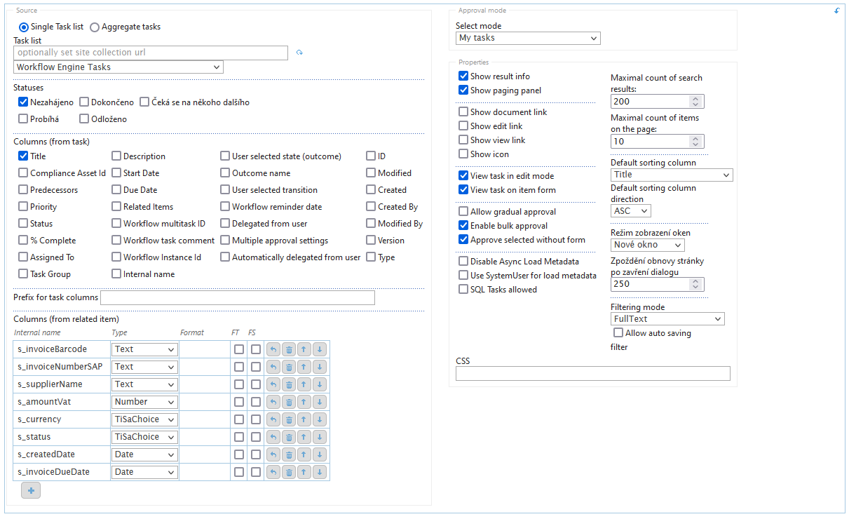
Webpart configuration includes:
- Tasks list – selection of SharePoint list in which Workflow keeps tasks – standardized name WorkFlow Engine Tasks, possible to set list from another site.
- Statuses – allows the definition of displayed tasks according to their state.
- Columns (form task) – enables to display columns which are defined for Workflow Engine Task list. These columns are displayed in the section "My Tasks" from the left and their order cannot be changed.
- Prefix for task columns – adds prefix to the My tasks table column in order to resolve a potential conflict with already existing columns on form – archaic setting, no longer needed in most cases
- Columns (from related item) – enables to display columns from related item. The order in which they are displayed in the section "My Tasks" can be changed. You can order them using the arrow keys up and down button. Use internal name of column for definition, you also need to define column type, allow filter for column and allow autosaving filter are optional. It is possible to format the view of specific column.
-
Approval mode – allows the definition of displayed tasks fields by task respondent
- All tasks – shows all tasks from defined task list.
- My tasks – displays only task assigned to current user.
- User defined users and groups – displays tasks of users defined in configuration field, possible to enter user group as well.
-
Properties – allows to define the behavior:
- Show result info – if enabled, displays the statistics of requested query.
- Show paging panel – activates/deactivates the option of task pagination. Requires to define the parameter "Maximum count of items on the page" when activated.
- Show document link – displays the link to related item.
- Show edit link – displays the link to the EditForm of related item.
- Show view link – displays the link for DispForm of related item.
- Show icon – displays the icon of the type of related item. Usable for document libraries.
- View task in edit mode – if disabled DispForm is used when the task is opened.
- View task on item form – Displays button that allows to open selected task in display form
- Allow gradual approval – used in conjunction with Allow bulk approval. User has to select tasks and enter bulk approval. After finishing one task from the selected group the next one will open right after it. The Workflow has to be set for this kind of behavior to work properly.
- Enable bulk approval – enables bulk approval, task will have checkboxes to choose task to complete. More settings within Assign task activity in Workflow Engine.
- Approved selected without form – Allows the approval of selected group of tasks at once without having to open the task itself in a edit/display form. Workflow has to be set for this kind of behavior to work properly.
- Disable Async Load metadata – if not ticked the general data about tasks is loaded first and then a second query is launched to get metadata of said tasks. If ticked only one query is executed that gets both general data and metadata before displaying
- Use SystemUser for load metadata – uses System User for collection of metadata instead of signed user
- SQL Tasks allowed – Displays sql tasks as well as onsite tasks.
- Maximal count of search results – maximal amount of tasks that will be displayed per user.
- Maximal count of items on the page – maximal amount of tasks on a page if the pagination function is enabled.
- Default sorting column – choose from selected columns from task and from related item.
- Direction – set sort order.
-
Window display mode
- Dialogue – displays modal dialogue window with task to do – script for message capturing is required for proper functioning.
- New window – displays task in a new web browser tab.
- Redirect – redirects directly to the page with the task – script for message capturing is required for proper functioning.
- Page refresh delay after closing the dialog – if the dialog window mode is selected, this value determines the page refresh delay after closing the dialog.
- Filtering mode – the position of filters and which filters are enabled
- None
- FullText
- Columns (bottom) – enables filter in search result tab at the bottom of the table.
- Columns (up) – enables filter in search result tab at the top of the table.
- Columns (bottom) + FT – enables filter in search result tab at the bottom of the table.
- Columns (up) + FT – enables filter in search result tab at the top of the table.
- Allow auto saving filter – enables to save used filter.
- CSS – enter a site-relative URL (e.g., /SiteAssets/style.css) to a CSS file located within the site for additional formatting. If left empty, no additional styling will be applied.
As part of the standard SharePoint webpart configuration, you can also use the standard webpart settings.
Search
Search is a SharePoint webpart that can be added to a page. Compared to the standard SharePoint full text search, TreeINFO search allows to search by individual metadata of each defined content type. Search results can be filtered and exported to .csv file.
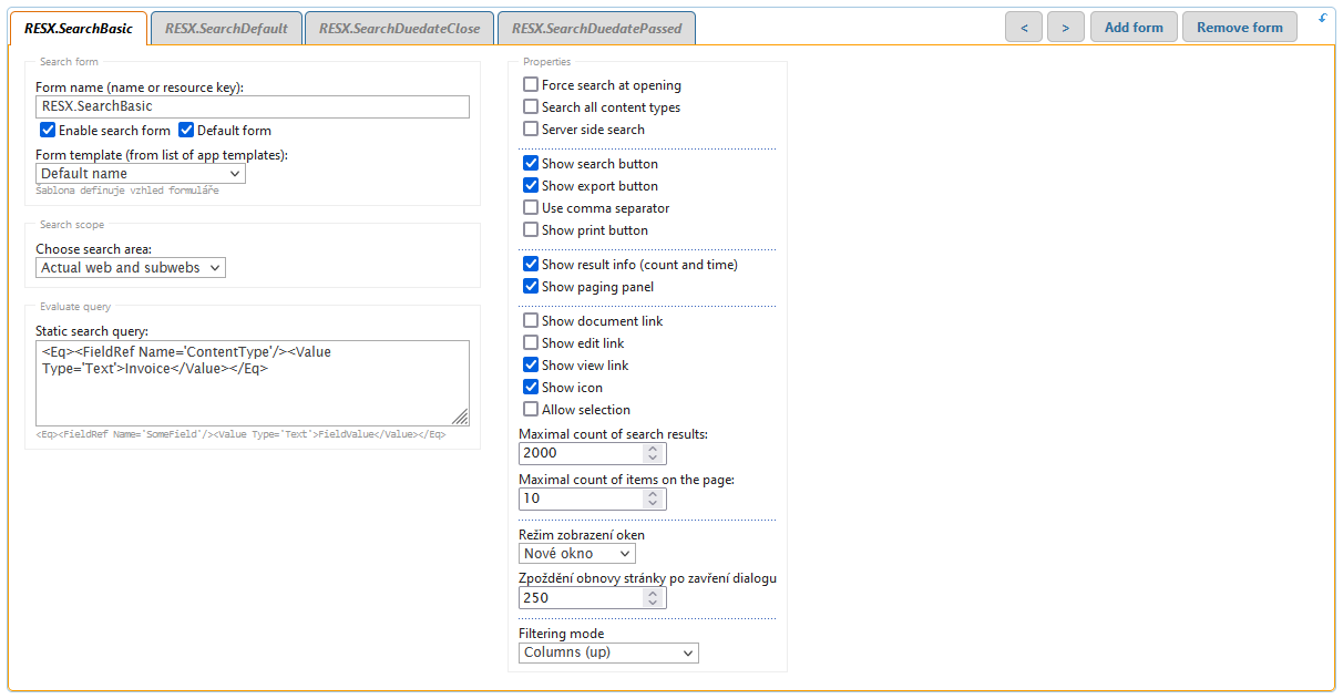
Webpart configuration includes options to create more search forms, each search form can have custom configuration.
-
Search form:
- Form name – define form name to be displayed on tab on homepage. You can use resources and define them in html templates in Search webpart templates.
- Enable search form – enables search metadata for tab which are defined in html template.
- Default form – displays when the page with search webpart is loaded.
- Form template – form template defined in TreeINFO Forms application in Search webpart templates.
-
Search scope
-
Search area – defines the area where the search will be performed, query can be applied.
- Actual web
- Actual web and subwebs
- Whole web collection
- In list – webs eg.: http://intranet.web.com, you need to define list URL (separate records with ENTER).
- In list – lists and libraries, eg.: /invoices, you need to define list URL (separate records with ENTER).
- In external list – you need to provide URL.
- External provider – you need to provide source and configuration.
- SQL Query – provide SQL connection string defined in Variables, define access mode and specify source name.
-
Search area – defines the area where the search will be performed, query can be applied.
-
Evaluate query
- Static search query – define CAML query to more specify search scope.
-
Properties
- Force search at opening – automatically executes search query defined in the section "Static search query" after displaying the page.
- Search all content types – search results include folders that contain the searched results as well.
- Server side search – in default the search is being execute over the local app only. If the system as a whole is spread out over multiple domains and if the search function is customized in such a way that it can execute search over multiple domains then this button enables/disables this function.
- Show search button – displays or hides relevant button. Used when "Force search at opening" function is applied.
- Show export button – displays or hides the button for export of search results in text file in csv format.
- Use comma separator – Exported data will be separated by a comma instead of semicolon.
- Show print button – Displays the print button. A print template must be set up in order for this button to work properly.
- Show result info (count and time) – displays the information about the query execution after the query is finished.
- Show paging panel – displays the results of a query in pages by N items – N is defined below.
- Show document link – displays active link for item vies.
- Show edit link – displays the link that redirects user to the edit page of an item.
- Show view link – displays a link that redirects user to the display page an item.
- Show icon – displays icon for easier identification of the document type.
- Allow selection – Displays the selection button next to every search result. This button does not do anything unless it is configured through script. A custom button has to be created linked to the selection as well. Can be used in combination with export function to only export selected result items
- Maximal count of search results – defined the maximum amount of results that will be displayed.
- Maximal count of items on the page – maximum amount of items displays on single page when the pagination function is enabled.
-
Window display mode – defines in which way are the items displayed from search results:
- New Tab – result item will open in a new web browser tab – default option.
- Dialog – result item will open in a dialog window – script for message capturing is required for correct functioning.
- Redirect – result item will open in the same window in which the search was executed – script for message capturing is required for correct functioning.
- Refresh delay after closing the dialog – if dialog mode is selected this value defines the refresh delay of the user closes dialog window.
-
Filtering mode
- None
- FullText
- Columns (bottom) – enables filter in search result tab at the bottom of the table.
- Columns (up) – enables filter in search result tab at the top of the table.
- Columns (bottom) + FT – enables filter in search result tab at the bottom of the table.
- Columns (up) + FT – enables filter in search result tab at the top of the table.
As part of the standard SharePoint webpart configuration, you can also use the standard webpart settings.
Supported localizations
TreeINFO currently supports the following localizations
| LCID | Language |
|---|---|
| 1029 | Czech |
| 1031 | German |
| 1033 | English |
| 1045 | Polish |
| 1051 | Slovak |
The LCID can be used together with the Resources property to define custom display text that changes based on the selected localization.
Log
SharePoint Online
With the SharePoint Online solution, logs are recorded to our in-house Azure database and are therefore inaccessible to users. Production logs are kept for a period of four months.
SharePoint On-Premises
Application logs can be set to both the file and the database or to both places at the same time. Logs are stored in one database, it cannot be distinguished, it is shared within the SharePoint farm.
The setup is done in the nlog.nlog file where the paths for log records are set.
Example of logs from the file system.
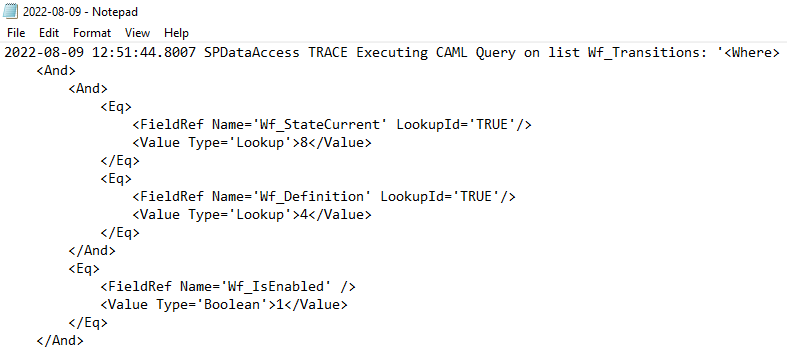
Example of database table dbo.Log.
Example of query results over the dbo.Log table.
FAQ
A FAQ is a list of frequently asked questions (FAQs) and answers on a particular topic.
More questions can be found in dedicated Stack Overflow TreeINFO Team. If you need access, contact treeinfo@aricoma.com.
function AdvancedTableCustomFunction_Rq_Details(inst) {
  var _OnPreRender = function() {
    var form = TiSa.Forms.CurrentForm;
    var s_status = form.FieldsByName.Rq_All_StatusChoice.GetValue();
    var columns = inst.GetConfig().Columns;
    for (var i = 0; i < columns.length; i++) {
	//default
      var c = columns[i];
      if (c.Id === "comment" || (c.Id === "number" && (s_status == "New" || s_status == "Returned")))
        continue;
      c.ReadOnly = true;
      c.Required = false;
    }
    if (TiSa.Forms.CurrentForm.FormData.s_status == "Director") {
      var c = inst.GetColumn("garant");
      c.Required = true;
      c.ReadOnly = false;
    }
    if (TiSa.Forms.CurrentForm.FormData.s_status == "Garant") {
      var d = inst.GetColumn("garantAppr");
      d.ReadOnly = false;
    }
  };
  inst.OnPreRender.push(_OnPreRender);
}The query limit is defined in central administration.
If there are more items in the list than that limit, you can only query through the indexed fields, plus these conditions must be at the top level of the query to be evaluated first. If the result of a query via indexed field is less than the set limit, the query can be refined using non-indexed fields.
Indexed fields can only be queried with the Eq, Neq, Lt, Leq, Gt, Geq, IsNull, IsNotNull condition. If Contains, StartsWith, In is used, the index is not applied. Only the And operator can be used to query over an indexed array, if Or is used then again the index is not applied. If the query has a condition on Created (anywhere) then it is prioritized first so the result must come out below the limit or the query will end with an error.
The solution is to set the indexes appropriately, there can be a maximum of 20, and modify the conditions appropriately. We solve this mainly in O365 where the fixed limit is 5000 and cannot be changed. In a static query there is usually a condition on the user or on the date (e.g. last 5000 by Created) and the fields are indexed.
<$FieldValue::SmlNumber /> Support
If this documentation doesn't answer your questions, please send us an email at treeinfo@aricoma.com.
Changelog
See the changes, fixes, improvements and updates released in the latest versions.
Build 1.13.25003.19002 Hotfix 24.3.2025
- Fixed Association of new fields and forms – Fixed functionality for associating new field and form objects through the TreeINFO application.
- Fixed Attachments display fix on subsites – Author and creation date were not displayed correctly on subsites.
- Fixed Task Form Customization – When clicking on an item in the task list, the item form now reliably opens every time.
Build 1.12.2502.19004 27.2.2025
- Added Archivation of large files – It is now possible to archive files up to a maximum size of 2 GB.
- Added Archivation – The logging function was enhanced for more precise analysis of failed archivation attempts.
- Added Search by Year and Month – A new option for searching by year and month has been added. The configuration is described in the documentation here.
- Updated ISDS field – Increased query processing limit during field initialization to over 5 000 items.
- Updated ISDS ZIP files – Updated the default ISDS field configuration to ensure proper handling of ZIP files.
- Fixed ARES search – Updated ARES search to correctly recognize diacritics in search terms.
- Fixed Print function in Search Web Part – Resolved an issue that caused an error when attempting to load the appropriate print template after clicking the print button in Search Web Part.
- Fixed Image Upload in Online – When an image is uploaded to the library in the online environment, SharePoint automatically creates a Managed Metadata field, which became mandatory and therefore prevented the task from being completed for the given document.
- Fixed Nested Advanced Table – Resolved an issue when transferring an Advanced Table containing a nested table with characters interpreted as separators.
- Fixed Currency column in Task Web Part – Enabled filtering and searching using Currency type columns in the Task Web Part.
Build 1.12.2411.11001 On-Premises (11.11.2024)
- UpdatedSearch – Userpicker – Optimization of UserPicker control behavior in the search form.
- UpdatedAdvanced Table – TargetColumn Copying – A new feature allows the use of the "TargetColumn" property to copy data into additional columns when inserting a reference; previously, copying was only possible to a single field.
- FixedAdvanced Table – Reference Search – Fixed an issue with searching in the reference dialog that only occurred when the search was targeted at a specific subfolder.
- FixedAdvanced Table – Paged References – Fixed an issue where related information was not fetched for non-displayed references when the reference table was paginated.
- FixedPrintForm – User Field on DispForm – Fixed an error that occurred on the display form when the printout attempted to display a user field.
- FixedUserpicker Paste Recognition Issue – Resolved an issue where copied and pasted usernames were not properly detected and added in the userpicker field.
- Fixed ISDS Box with OpenCondition Property – Fixed an issue where the ISDS box search field remained focused (allowing immediate typing) when used in combination with the OpenCondition property.
- Fixed ISDS Box Copy – Fixed an issue where the ISDS box field was sometimes incorrectly populated when an item was created using the copy function.
- Fixed ARES connection fix – Change encoding from ASCII to UTF8 to support special characters.
Build 1.12.2409.10001 Hotfix (10.9.2024)
- Added Online Custom Scripting Verification – Implemented a status check to ensure that custom scripting is enabled on the site being updated.
- Added Online Configuration Backup – Introduced functionality to automatically create a backup before installing a new version of TreeINFO Forms, ensuring configuration settings are preserved in case of loss during the update process.
- Fixed Counted Column Overflow Fix – Resolved an issue where the Counted Column malfunctioned when the number of counters exceeded a specific limit.
- Fixed Custom Formula in Search Template Export Bug – Fixed an issue that prevented the search export function from working when a custom formula was included in the search template configuration.
- Fixed .aspx Configuration File Deletion During Installation Bug – Resolved an issue where TreeINFO Forms configuration files were deleted if the installation process failed due to custom scripting being disabled on the site.
- Fixed Reference Metadata Copy Bug – Fixed an issue that caused metadata to be lost when creating a reference in a Reference Advanced table.
- Fixed Missing Items in Reference Advanced Table Dialog Window – Fixed an issue where certain items were missing in the dialog window of a Reference Advanced Table when used with the FolderUrl property.
- Fixed Missing Metadata for Hidden Items in Reference Advanced Table – Fixed an issue where metadata information was absent for items that were found but hidden in the Reference Advanced Table due to the page's maximum item limit being reached.
- Fixed Outdated Data in Printform Bug – Fixed an issue where outdated data was displayed on a printform if opened from an edit form. This occurred when a user edited the form without saving and then attempted to use the print functionality.
- Fixed Printform User Field Error – Resolved an issue that caused an error to occur when a user field was included on a printform.
Build 1.12.2406.25001 (25.06.2024)
- Fixed New form preview aspx – Introduced a new form preview ASPX file that resolves issues caused by the latest Microsoft update.
- Fixed Column configuration erasure bug fix – Resolved an issue where column configurations were erased after installing a new TiSa version. If the column configuration is erased, it will now be moved to the recycle bin.
Build 1.12.2406.19001 (19.06.2024)
- Fixed TaskForm and DocumentPreview relative URL update – Updated the relative URLs for TaskForm (/sitepages/tisa/TaskFrom.aspx -> /tisa-sitepages/tisa/TaskFrom.aspx) and DocumentPreview (/sitepages/tisa/tisa.preview.aspx -> /tisa-sitepages/tisa/tisa.preview.aspx) in response to the latest Microsoft update, which prevents .aspx files from being added to the SitePages document library.
Build 1.12.2404.18001 (18.04.2024)
- Updated Updated the maximum search results limit for ExternalLookup, Webpart search function, and Advanced table reference function. – Increased the maximum search result limit from 5,000 items to 500,000 items for ExternalLookup, Webpart search function, and Advanced table reference function.
- Updated Updated ISDS box – non existent inbox – Updated the ISDS box field. If the provided inbox does not exist, it will be added as a recipient regardless.
- Fixed ARES connection fix – Fixed a connectivity issue that was causing the ARES external function to malfunction.
- Fixed TiSa/WFE workflow desync fix – Corrected an issue that led to workflow desynchronization between the WFE version and the TiSa version.
Build 1.12.2403.17001 Hotfix (17.03.2024)
- Updated For On-Premises Only – IsUserInGroup/IsUserInGroups/IsUserInSpGroup/IsUserInSpGroups – Recursivity – Updated the IsUserInGroup function and its variants to support recursive searching for the specified group. This recursion can be disabled using the new parameter disableRecursive.
Build 1.12.2402.12002 Hotfix (12.02.2024)
- Fixed Reference Advanced Table with over 5000 results bug fix – Fixed an issue that caused Reference Advanced Table to not work properly if the searched list/library had over 5000 items and if the search query had more then one column to search by.
Build 1.12.2401.30001 (08.02.2024)
- Added Fulltext search function for Advanced Table – Added search function for Advanced table – can be customized for more accurate search or left as is for complete fulltext search over all collumns
- Updated Search webpart, External lookup, Reference Advanced Table – search update Updated seach function for Search Webpart External Lookup column and Reference Advanced table column to function properly if the searched amount of items is over 5000
- Updated Updated support of multiple items selection in view Updated support of multiple items selection in view for more advanced use (for example validation for specific number of selected items etc.)
- Updated Updated Print Templates section in the TiSa documentation – Updated Print Templates section in the TiSa documentation to provide clearer instructions on proper configuration.
- Fixed Upload button pop up window fix – Fixed an issue that caused pop up window to show up if the upload button was clicked instead of regular upload window in newer version of Sharepoint.
- Fixed Print template content type filter on new form bug – Fixed an issue that caused print templates to be unable to be filtered by content types on new form
- Fixed IsUserInGroup fix – Fixed an issue that caused IsUserInGroup to not function properly if used on a field with multiple values allowed
- Fixed Online – Search Webpart SP2SQL fix -Fixed an issue that caused Search Webpart to not work properly if the search was done through SP2SQL in database
- Fixed Reference Advance table jquery bug fix – Fixed an issue that caused reference item created through json to be incorrectly compared in the context of duplicities as a whole json string instead by individual values
- Fixed Advanced table deletion bug fix -Fixed an issue that caused empty advanced table after deletion of its values to be represented by empty field instead of an empty string
- Fixed Added missing ColorTheme property in xml form of workflow – Added missing ColorTheme property in xml form of workflow that specifies the color of individual bubbles in UI version of workflow
- Fixed External Lookup CopyElements multiple user field bug – Fixed an issue thta caused External lookup CopyElements function to not work properly if more then one user/group was retrieved from an user field
Build 1.12.2310.27001 (08.11.2023)
- Updated Attachment table Float DisplayMode with EnableView Updated EnableView configuration to work properly with DisplayMode Float
Build 1.12.2308.15002 (24.08.2023)
- Added Attachment field Accept and DisableMultipleUpload properties – Added Accept (attachment field will only accept specified types of documents) and DisableMultipleUpload (forbids user from uploading more then one attachment at a time if set to true) properties to attachment field
- Added Attachment field ForceEditFormAfterUpload, AllowOverwrite and DeleteFileWhenItemDeleted properties – Added ForceEditFormAfterUpload (Edit form will be opened of a just uploaded file), AllowOverwrite (Instead of creating a copy of a uploaded file if duplicity is found, overwrites the already existing file of the same name) and DeleteFileWhenItemDeleted (Deletes the file of the attachment from Sharepoint attachment library if deleted from form) properties to attachment field
- Updated Active task update – Task table now shows results in different languages; Updated behaviour of opening and closing tasks through Active task table
- Fixed Replace function bug – Fixed an issue that caused certain forbidden symbols to be incorrectly copied to destination file (symbol '%' still causes issues, if coppied the resulting file will contain '%25' instead of '%')
- Fixed UpdateChildren bug – Fixed an issue that caused updatechildren function to not work correctly in combination with user fields
- Fixed "DisplayMode": "Float" in combination with EnableView bug – Fixed an issue that caused EnableView to not work correctly if used in combination with "DisplayMode": "Float"
- Fixed Validation during save log issue – Fixed an issue that caused errors that appeared during saving of an item to not appear in log if the error was of validation nature
- Fixed Onchange with attachment bug – Fixed an issue that OnChange receiver to not work correctly if used in combination with attachment field
Build 1.12.2306.19004 (19.06.2023)
- Updated Attachment field update – forbidden symbols – Rename function now correctly translates substitute symbols (for example %20 as a space symbol)
- Updated Attachment field update – paging update – Attachment table now correctly shows the configured number of rows
- Updated Attachment field update – file size update – Size column now dynamicaly changes depending on the file size (instead of showing 1024 kB it will now show 1MB)
- Fixed Attachment field – GetValue() bug – GetValue() method now correctly shows checked or renamed rows
- Fixed Attachment field – AutoNumeric.js library dependency – Added dependency on AutoNumeric.js library
- Fixed Attachment field – Checkbox header row bug – Header row checkbox now correctly check itself if all rows are selected manualy
Build 1.12.2306.15002 (15.06.2023)
- Added Errorcallback – Added ErrorCallback function that returns error message acording to predefined template
- Fixed Advanced table User multiple bug – fixed an issue that caused only the first user to be filled in a user multiple column if the field was filled automatically
- Fixed Secondary client secret bug – fixed an issue that caused secondary client secret to not work properly
- Fixed ExternalLookup + Source – SP bug – fixed an issue that caused ExternalLookup function to not work correctly if two identical lists existed in different file path
- Fixed Advanced table sum bug – fixed an issue that caused advanced table sum function to not work correctly if a new row was added or removed
- Fixed AlwaysUpdate + conditional expression bug – fixed an issue that caused AlwaysUpdate property to not work properly if used in combination with ConditionalExpression
- Fixed SQL task infinite load screen bug – fixed an issue that caused incorect message to appear if user opened an SQL task that was already deleted through link
- Fixed SourceList URL bug – fixed an issue that caused for example folders that were created inside another folder to be placed in root instead inside said folder if created through custom button
- Fixed Copy to different list error – fixed an issue that caused an error when using the copy function to copy data to different list
Build 3.11.2301.23001 ()
- Added Allow selection + export button – search function – Updated search function. Selection can now be used in combination with export button to export only selected items.
- Updated Instance status change receiver – The receiver for instance status change was made asynchronous. If the instance update crashes it will be automatically restarted through queue retry mechanism.
- Fixed Column type User in combination with AllowMultipleValues property bug – Fixed an issue that caused an empty array to appear in a User column if the column was filled first and then erased when combined with AllowMultipleValues property. Fixing this issue may cause errors in certain Workflows.
- Fixed GetTempFileName fucntion – Fixed an issue that caused the GetTempFileName function to not return unique file name.
- Fixed Advanced Table checkboxlist bug – Fixed an issue that caused Advanced table to not show properly if used in combination with CheckboxList property.
- Fixed EL multiple choice bug – Fixed an issue that caused multiple choice to not work properly if the data source did not have trimmed values.
- Fixed DisplayGroupsAsTabs bug – Fixed an issue that caused the DisplayGroupsAsTabs property to not work properly if custom group Ids were used.
- Fixed External path attachment bug – Fixed an issue that caused the preview of a document to not show properly if the source path of the attachment was of External type.
- Fixed JS editor freeze – Fixed an issue that caused the JS editor to freeze on random while being used.
- Fixed Difference in exported Tisa settings fix – Fixed an issue that caused difference in exported Treeinfo for Sharepoint application settings if exported by UI as oppose to by script.
- Fixed Research function bug – Fixed an issue that caused the value to not reset if the value was empty.
- Fixed EL value change bug – Fixed an issue that caused additional value to be added if the source contained only one value.
- Fixed Secondary client secret authentication bug – Fixed an issue that caused online environment to not authorize through secondary client secret if the primary is non functional.
- Fixed Tabs change bug – Fixed an issue that caused the content to not change if the user changed tabs on form.
- Fixed Form designer export duplication – Fixed an issue that caused the export to be attempted twice if done through Form Designer resulting in an error.
- Fixed Counted column receiver unique internal name bug – Fixed an issue that caused receiver to operate with first found value if there were multiple columns with the same internal name.
- Fixed Counted column FileLeafRef rename bug – Fixed an issue that caused FileLeafRef function to not work properly resulting in incorrect renaming of a target file.
- Fixed Counted column Expression value bug – Fixed an issue that caused Expression function in Counted column to only accept specific values and not expressions.
- Fixed Random item addition bug – Fixed an issue that caused errors when adding a new item to data message.
- Fixed Bulk select button in search results bug – Fixed an issue that caused the bulk select check box to stay checked even if all the result items were not checked.
Build 1.12.2211.29001 (29.11.2022)
- Fixed JWT token registration bug – Fixed an issue in communication between Application and Sharepoint causing incorrect registration.
Build 1.12.2210.20002 (20.10.2022)
- Fixed Advanced Table – Fixed an issue where if the advanced table was in a checkboxlist mode it would not function properly if the table was tied to a condition.
Build 1.12.2210.13001 (13.10.2022)
- Added User edit notifications – Functionality allows to prevent overwriting of local data by releasing a new version of the application.
- Added Integration of task functionalities into forms – Option to add "Load active tasks" button to display active tasks on form using designer.
- Updated Option to sort items in tables – For tables it is now possible to select the direction of sorting values in columns.
- Fixed Option to format date from SQL on print form – Ability to format data on print templates retrieved from SQL.
Release Q2 (2022)
- Added Rating – New type of field for star classification.
- Updated Export of filtered search data – Support for export partial filtering.
- Updated Import / Export settings – Option Variable will no longer be a checked by default.
- Updated Advanced table – Improvement of the checkboxlist and attachments modes with a new OnInvalidate event, so it will be possible to customized with script.
- Fixed Archiving – Archive template fix – if a date was used in the expression, the format was returned in UTC, now it is returned as local.
- Fixed Form action fix – When the user clicked back in the browser, the action could be performed again because the previous page was saved in the browser history. Now it is not saved.